The 2 designs bellow are my rejected designs for my mobile application and website.
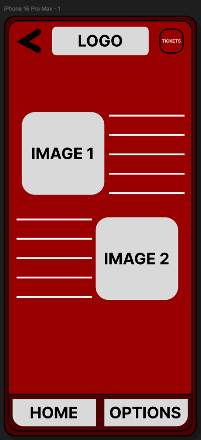
There are a few design flaws within the mobile application such as the tickets button being at the top right with a wrong choice of colour as it blends in with the background. Secondly the images in the middle must be enhanced by size as there is a lot of “white space” within the screen. Next the back button on the top left should be ultimately removed as it would lead to nothing because the page shown above is the main menu page. Additionally the buttons on the bottom are too big and must be polished for aesthetic purposes. Finally the logo should be loved somewhere else, this is because the majority of iPhone now have a “Dynamic Island” which hinders the view of the logo, moving it would benefit the brand identity as the users would be able to see who they’re purchasing from etc.
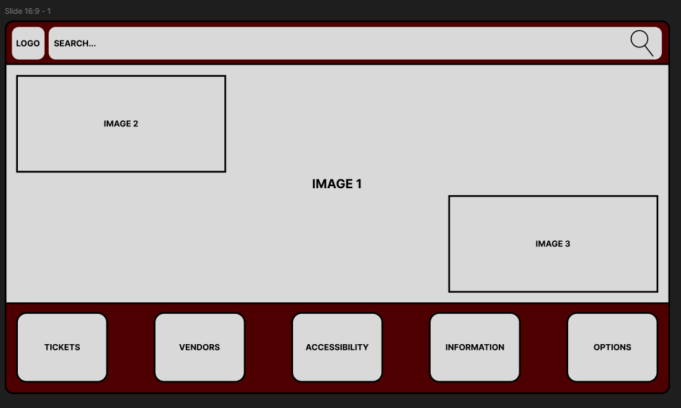
There are a few design flaws within the website, the first one being the buttons at the bottom are too big and make the website have a mobile application aesthetic, this needs to be changed to a organised method to give more room for information on the page. Secondly the 3 images in the middle of the screen may look very awkward and may blend in with one another which would confused the user, in addition none of the images have any information so the user would not know what they’re looking at. Finally the search engine at the top of the screen is too long and could be shortened with the addition of a hot bar beside it.