I have chosen to create a book shop that prioritises selling comic books from common £1 comics to more desirable comics that are out of print for the collector side of customers. The comic store is called “Northern Collective” and creations for the store can be seen below.
Planning.
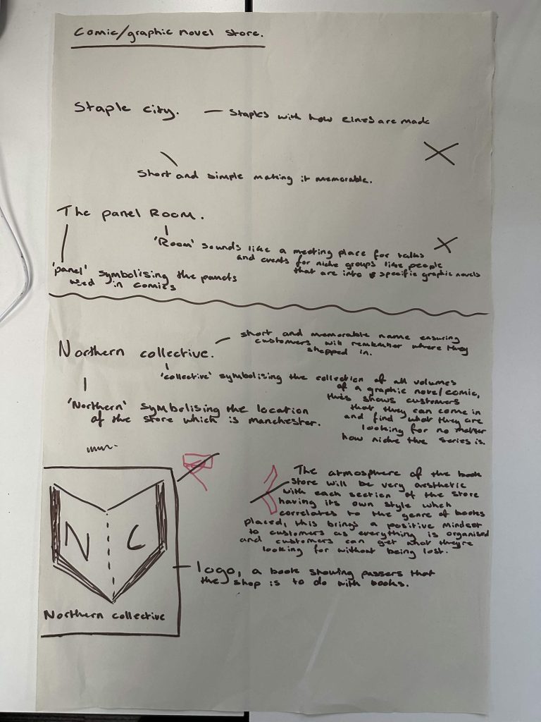
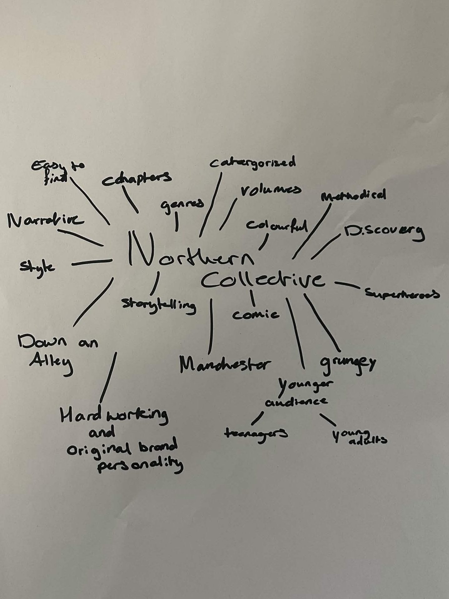
Figure 1 and 2 display the early thinking and planning of Northern Collective with annotations explaining why the design choice of the logo was a successful upcoming construction. The brand name was constructed with the thought of having a comic book store that was in the north part of England that had collectible comics, hence the name “Northern Collective”.
Brand Guidelines.
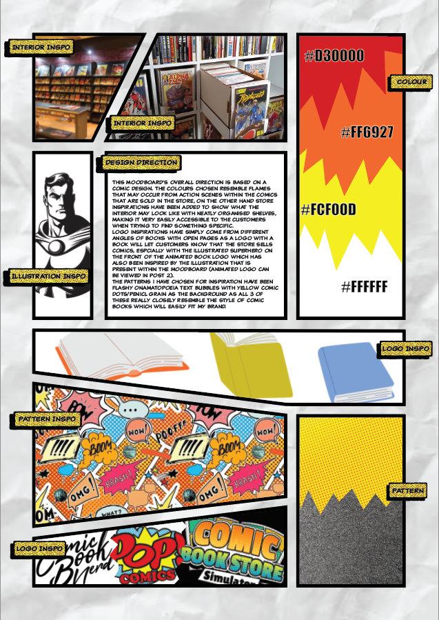
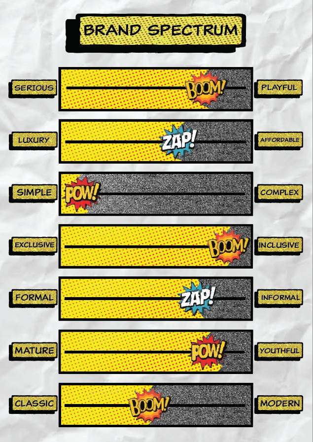
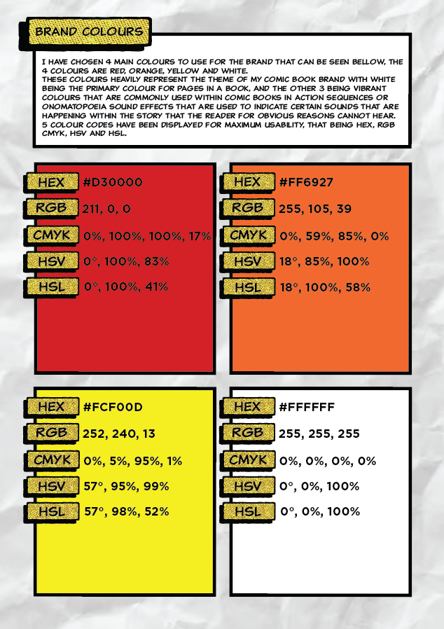
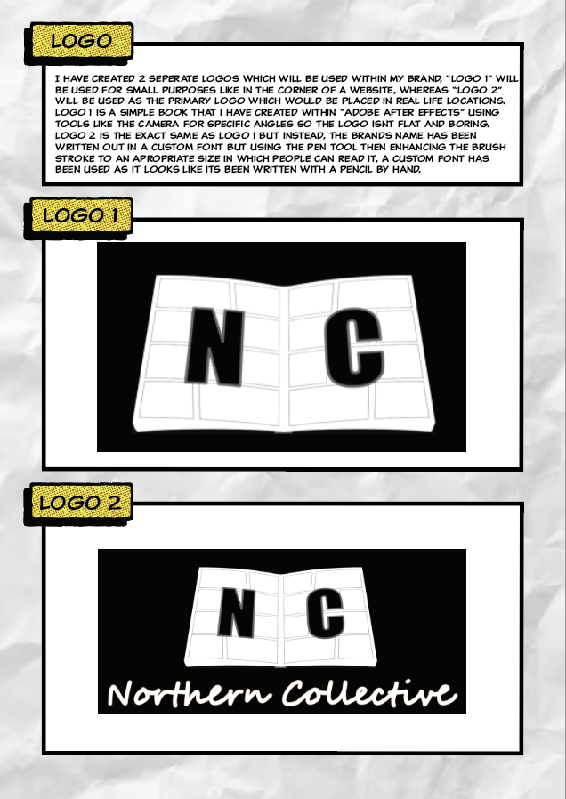
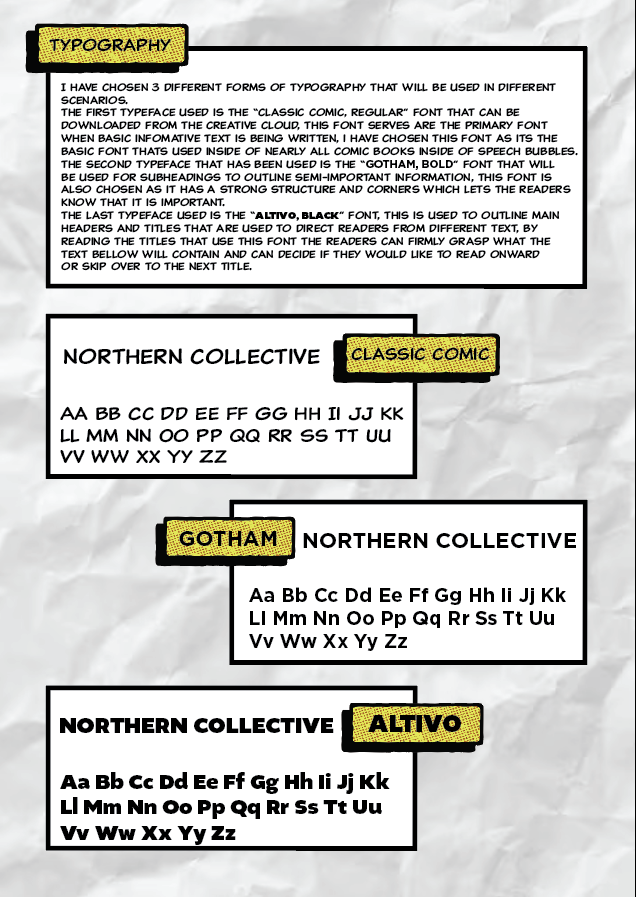
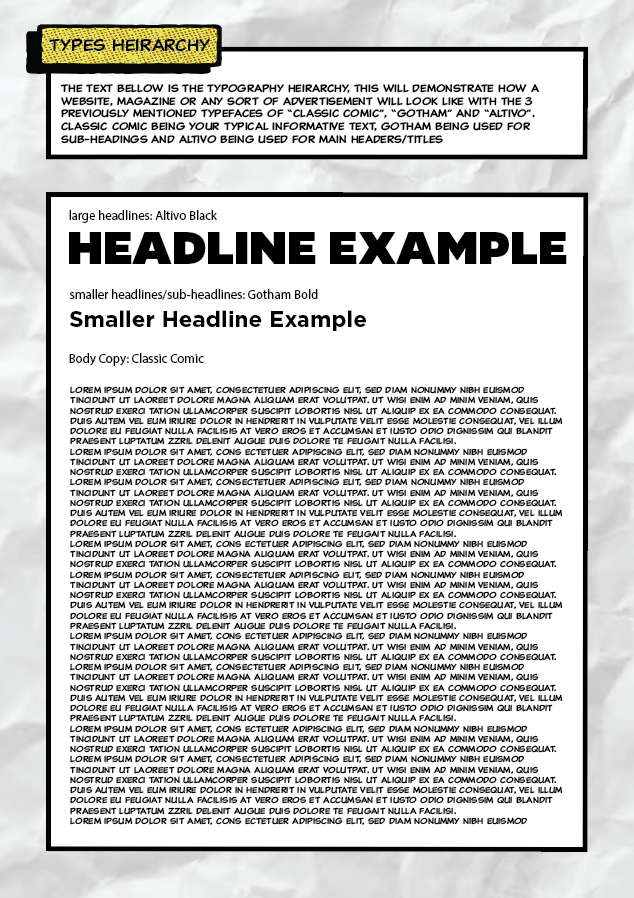
Figures 3 – 8 are the brand guidelines I have created. These guidelines dictate all of the specific elements used for the brand and animations. The guidelines present things like the typography, brand colours, brand spectrum, mood board and logo.
Animated Logo.
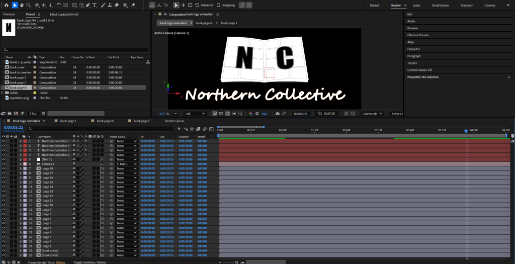
My design thinking in the Northern Collective animated logo has been to construct a 3D book that opens and rapidly flicks to a random page with the brands name (abbreviated), with the full name being written bellow. The book was created with skills that were learnt in class like layering multiple pages on top one another in a 3D setting.
Animated Typographical Example.
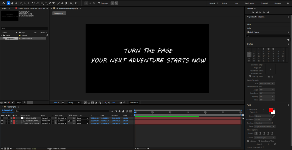
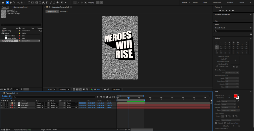
2 Different typography’s have been constructed that can be viewed above, the first one was a simple typography that jitters with a scribble text to mimic someone writing with a pencil just like the first mock-ups that happen when illustrating comic books, on the other hand the second typography was created for important titles that would catch the viewers attention, done in a bold typeface that matches comic book aesthetics.
Animated Illustration.
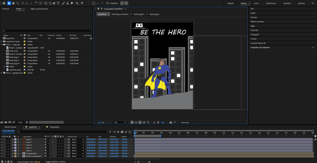
Lastly the illustrated animation has been constructed, this was done by illustrating a superhero on Adobe Illustrator with 3 separate layers, that being the superhero, cape and buildings. This was done so the cape and buildings could be separately animated. The cape was given a simple effect to make it look like the wind was blowing on it, whereas the buildings were being thrown to the left side of the screen to give off a movement effect like the superhero was standing on something that was travelling at high speeds, additionally a superhero was animated so it would fit the brands image of comic books as superheroes are primarily depicted within comic books.
Animation Proof.