Within this blog post I will be explaining the 2 typographical name logo’s I have constructed using Adobe Illustrator.
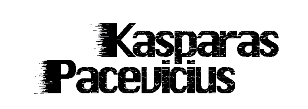
Firstly, the font used is “Silom” with the “pixelate-mezzotint” effect, this is because I wanted to give it a cybernetic feel purely for my passion of video games. In addition, I have used the “Gradient” tool with the “pixelate-mezzotint” effect once again to give it a dematerialisation/glitch effect to once again support my passion for video games.
On the other hand, I have reduced the spacing between each character to keep it compact and professional. In addition, the characters are so close to each other it also gives the characters a night sky look, and the white dots acting like stars which links to myself as I am a night owl and enjoy spending my time awake at the night.
Lastly, the positioning of my name is specifically placed so that the two “i” in my last name line up perfectly with the “p” in my first name which is purely an aesthetic feature.
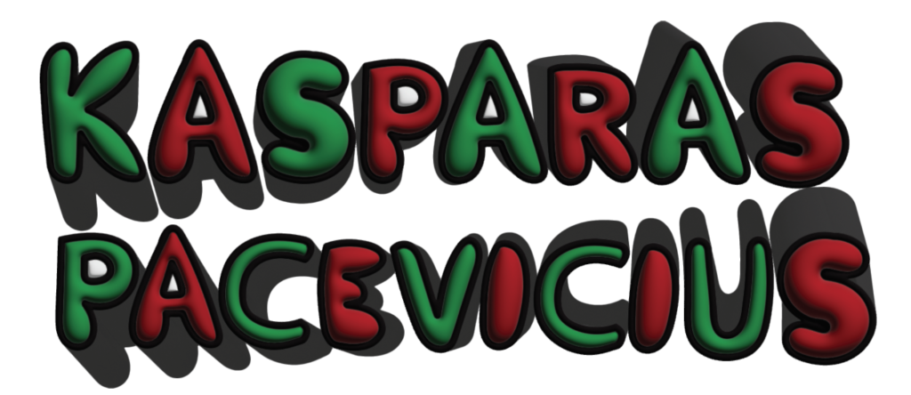
Firstly, I have not used any default or downloadable fonts, the font was originally created by myself from scratch using the “paintbrush” tool and increasing the “fidelity” to the max for smooth strokes, and a thick black outline to make the words pop and easier to read. I was going for a bubbly font style as it represents my bubbly and fun personality.
Secondly, my reasoning behind the choice of colour comes from my birth date. I was born on the 24th of December which is commonly known as Christmas Eve and adding a green and red colour combination suits the 2 primary Christmas colours.
On the other hand, I have used a 3D tool called “Inflate” to give the characters that round balloon feel to furthermore expand on my point on making the characters look bubbly just like my personality. Lastly, I added a curved shadow to every character to make the characters look like they have motion, purely for an aesthetic reason.