Within this post I will be developing the concept ideas that myself and the collaborative group I am apart of have thought of, the goal for these concepts is to stand out among competitors such as VFS (as mentioned in previous posts) and bring excitement towards the upcoming 2026 world cup.
Initial Ideas and Concept Development.
Core Concept
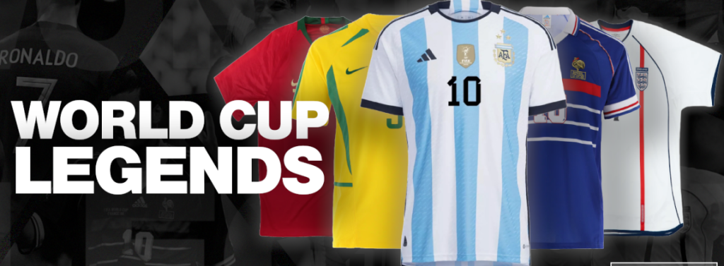
The core concept that my team and myself have come up with is to create a campaign that shows off players from different football eras which will be called “World Cup Legends”. Players from different world cups will be showcased with the appropriate shirts.
Additional Concept.
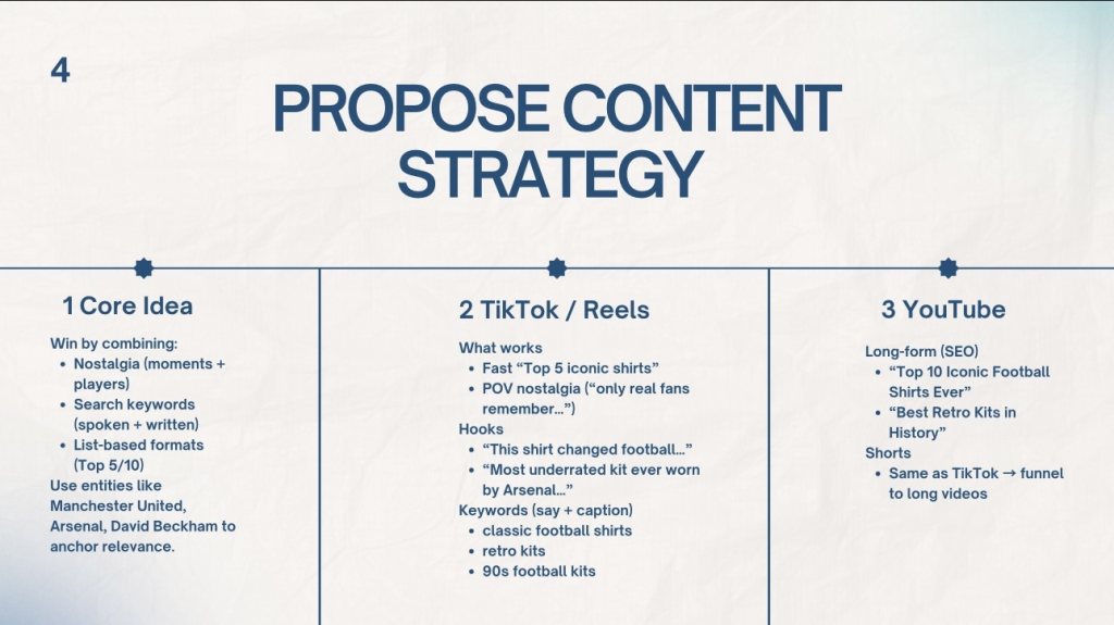
The team and I have decided to create a concept that relies on combining nostalgia (moments + players), search keywords (spoken + written) and list-based formats (then and before). With these 3 combinations in mind, the best course of action was for us to create TikTok/Instagram photos/videos showcasing shirts from famous football players from decades ago compared to the present. These sorts of photos/videos would include older outfits to fit the nostalgia category to have multiple age demographics engage with the video. Within the photo/video, a hook will be implemented with text phrasing “The last one is crazy!”, this will be done to grab the users attention and keep them waiting till the end.
Development of Concepts.
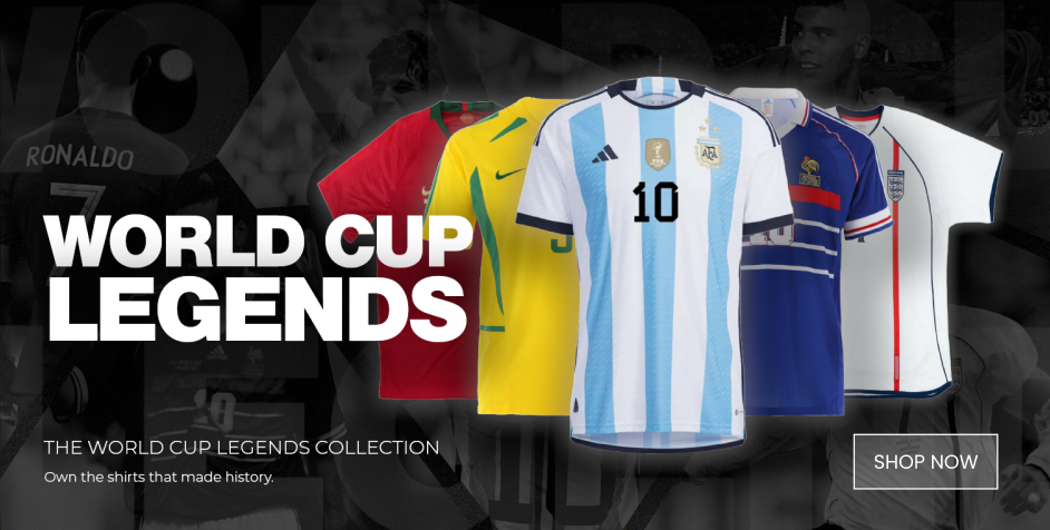
The “World Cup Legends” concept has been slowly developed with designs showing off different football shirts from iconic players from the 90’s, 2000’s etc that can be viewed in figure 2. This banner will later be used within the website as a way to promote the campaign and get people interested into the different eras of the world cup, this banner was additionally created to promote the world cup that will be held in 2026.
Teamworking.
Clear CTA.
The marketing team suggested that a call to action button was needed to encourage users to get engaged and check out the different sort of shirts that are for sale. This was simply done by adding a “SHOP NOW” button that will redirect users to the “world cup landing page” in which a plethora of players can be chosen from to then view the shirts, this can all be seen in figure 3.
Reflection.
Within the creation of different assets for the campaign reflection and communication was key to success. For one of my Instagram posts the marketing team suggested branding it with the logo of the 26th year world cup, this was done to furthermore enforce the campaign.
Another piece of reflection was given by my peer Lewis Wainwright when creating the website for the campaign, this was done in the “Product Detail Page” to give the additional text on the far right hand side on the screen a background purely for aesthetic purposes, and so the background doesn’t interfere with the text.
Lastly one of the marketing team members suggested using a background that spells out the players name along the whole page when clicking on a specific player to make it look nicer. This was done by typing out “MESSI” then copy and pasting the name row by row and finally placing it onto the page with a small opacity percentage so the background did not interfere with the text.

Design Work.
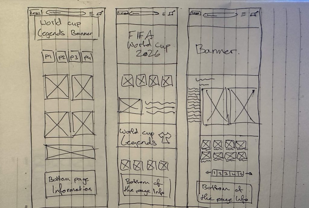
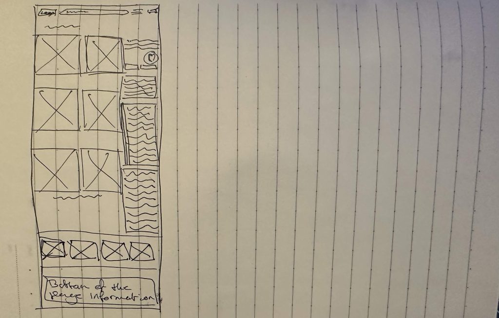
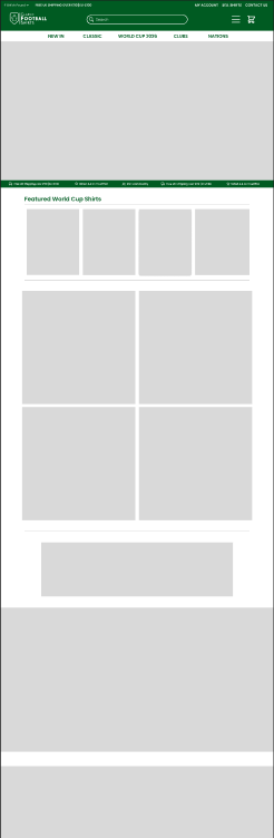
A quick wireframe was created when planning out how the websites frame would look like with the help of Lewis Wainwright to successfully place images and text in the correct area. Once the wireframes were finished, an immediate start to the website Home page development was made with minimal design to first understand if the layout was appropriate. The wireframes can be seen in figures 5 and 6.
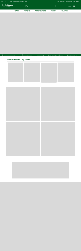
Once we finished the prototype for the home page we realised that the layout was missing something, this is when we turned to the marketing team and asked for direction. They assisted us in suggesting adding a “our locations” section at the bottom of the page to ensure customers can acknowledge where they can go to visit our in person store, this can be seen at the bottom of the page when comparing the before and after of figures 7 and 8
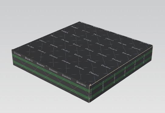
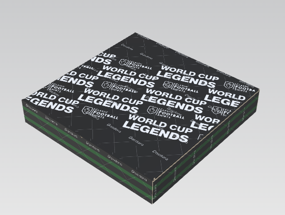
Lastly another form of feedback that has been given with design work was the creation of the mock-up packages, when creating the package it felt really bland so I once again reached out to the marketing team and they suggested I make a pattern on top of the box to promote the 26th year world cup. With this information in mind I created a simple pattern on top of the box that can be seen in figure 10 that works effectively to satisfy the marketing team.