Within this post I will be talking about my mid fidelity Figma website prototype for PC, bellow there will be screenshots of all the pages within the website with appropriate notes bellow the collection, such as how the users will explore the pages.
Figma Link:
https://www.figma.com/proto/MZS3eaCmcTVnZ1qEHMcvns/Mid-Fid-Website?node-id=0-1&t=nZXXegJiTae9eIHS-1
Mid Fidelity Website Prototype With Small Explanation:
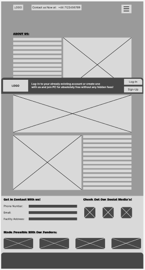
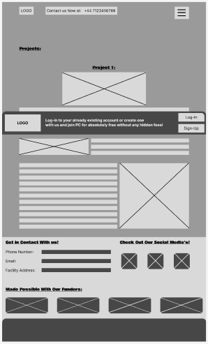
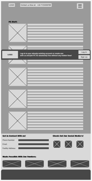
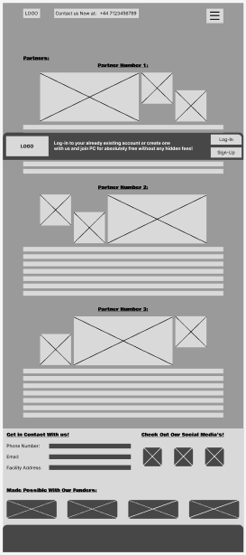
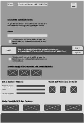
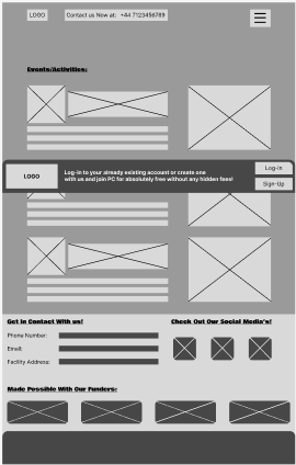
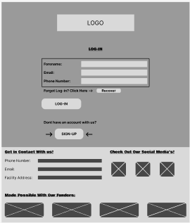
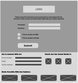
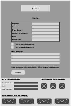
Within the main pages there will be a CTA in the middle of the screen, once users open the website on their personal computer the CTA will remain on the bottom of their page, which can be viewed upon within the link provided above. Squares with a “X” within them is a reminder that an image will be placed there once moved to high fidelity, in addition the bars along side the images or headers implicate that there will be text there to support the image/header, once again it will be finalised within the high fidelity version.
Notes About Navigation and Structure:
Within most of my pages I have created bizarre looking image placements alongside the text, this is done to keep the website fresh and enjoyable to explore with dynamic placements, which ultimately increases the user experience.
At the bottom of every page I have included a small section with additional information such as PC’s contact details, social media and the funders that made all of this possible. This is done to increase user engagement with the organisation by convincing them to contact PC with their many options available. In addition funders have been included to give them credit for their participation of making all of this possible to show users and the funders that PC is grateful, on the other hand users can check out the funders themselves online to see what else they’ve helped with, which will give the funders possible future users/customers.

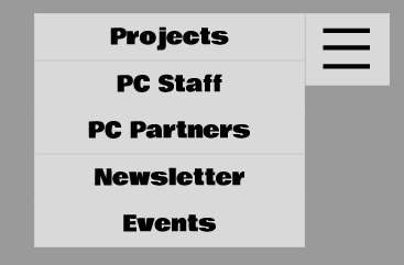
Within the core pages there is a burger drop down menu at the top right of the screen, once users click this menu they will be able to access the other pages, then to go back to the homepage users can click the backwards arrow on their software or click the logo. Once users click on a page or the logo a small transition will play to give the website a little more movement.

Within the core pages resides the previously mentioned CTA that follows the screen to encourage users to create an account or log-into their already existing one. To access the sign up/Log-in pages the user simply presses the log-in/sign-up button located on the CTA which is show above.
Finally once users reach the sign-up page all of the necessary information is clearly outlined, with the addition of having users opt-in or opt-out of receiving emails or SMS’s to do with PC and their upcoming changes/events. These boxes are added within the page to convince users on engaging more with PC and gathering information about what users think. Once an account has been created a user may forget what their details are, if this is the case an additional page within the website has been provided to help users gather their details and avoid trouble logging back in, this can be done by pressing the “Recover” button along the “Forgot Log-in? Click Here –>” text, this option has been created to keep user retention as once a user forgets their details without a way to get them back its highly likely they’ll abandon the website permanently.
What’s Working/Needs Refining?
Within the website the buttons are working as intended, the burger drop down menu is creating buttons on every page and the log-in/sign-up pages are working around each other. The website needs a little more refining such as adding colour, text and images, this will be done within the high fidelity version of the prototype.