Within this post I will be talking about the process of to my final production posters used in the NHS campaign of “5-A-DAY”, decision-making, consistency, and visual leadership will be reflected upon with art direction context on aspects such as narrative, cross-platform thinking, connectivity, consistency and concept development.
NHS “5-A-DAY” campaign.
Mood Boards.
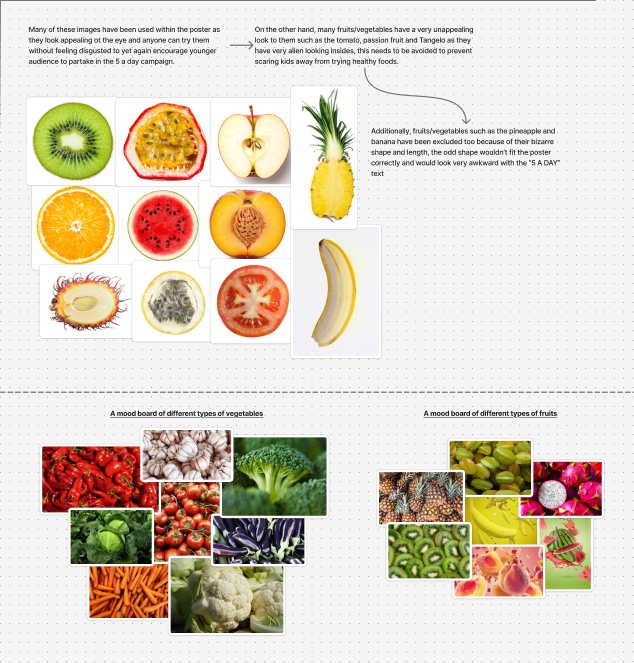
I have created a series of mood boards bellow each serving its own purpose, with the bottom two I explored different types of fruits and vegetables I could use in the campaign whilst having a few things in mind such as, if the fruit/vegetable looks appetising. If the fruit/Vegetable is known for bad taste or smell such as garlic, it will not be included as this campaign is trying to get younger audiences to eat their 5 a day. On the contrast if the fruit or vegetable has an appetising flesh such as the apple or orange people will be encouraged to try it. Ultimately the good looking fruits/vegetables will make it to the final poster design as they’re the most appealing.
Sketches, Notes and Visual Mapping.
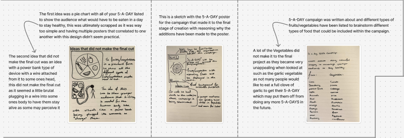
I have created rough sketches which can be viewed in “Figure 2”, within these sketches ideas were explored which did not make the final cut. On the other hand, typography, logo and QR code placement have been annotated with reasoning behind the decision such as; the logo and QR code being in the corners so the audience can focus on the posters visuals. A few notes have been added in the first stages of the campaign to determine what fruits/vegetables exist and could be used based on their look.
Final Posters.
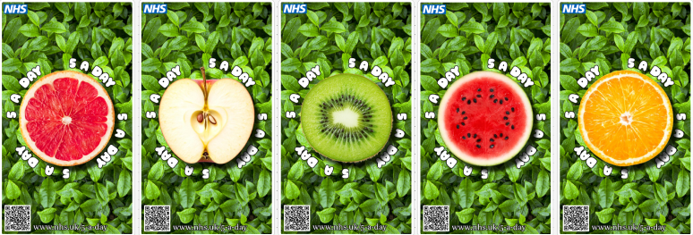
I have constructed 5 authentic posters for the 5-A-DAY campaign which can be viewed bellow. The design consists of a fruit/vegetable cut in half revealing its flesh to show the beauty and vibrant colours with “5-A-DAY” written around it to remind the audience what this poster is about, additionally a leaf background has been added to show that these foods aren’t harmful and are healthy and that they are natural.
Prototyping and peer feedback for improving my decision making allowed me to focus on the consistency of the size of the fruit/vegetable. One form of feedback that has been implemented was to have the text in a bubbly format in a large font size around the round fruit/vegetable, with the addition of the NHS logo and QR code to ensure the audience can verify who these posters are made by with a direct and easy access link/scan of the QR code.
Storytelling has been implemented within these 5 posters together, each poster displays a different fruit/vegetable being a grapefruit, apple, kiwi, watermelon and orange whilst containing the same visual structure of a cut fruit/vegetable in the centre showing consistency. The approach works the best when placed together or in close proximity to one another by showing the audience what a 5-A-DAY looks like.
Art direction decisions have been maintained throughout the campaign project in places such as; mood boarding and sketching. This project proved that art direction is much more sophisticated than creating visuals, but instead enhancing communication clearly and effectively across platforms with a cohesive visual strategy.
Figma Link:
https://www.figma.com/board/aa89eO4ZhFh00jAlxsKqGa/Untitled?node-id=0-1&t=FuMYTKIQdmCxnDzh-1