Introduction.
“PC” is a network of local community groups made up of groups such as; “OSHI”, “Butterflies”, “Community Knowledge Matters”, “Imagining Futures” and many more. These community groups will be represented through a unified digital campaign which will be shown bellow with in depth analysis throughout storytelling, branding, and ethical design exploration. The mission for “PC” is to create a functioning website to further assist the local community groups in achieving their version of success. This can be done firstly by purchasing any of the following domains as they have not been taken by others, such as “Participatorycollective.com”, “.co.uk”, “.org” etc.
The benefits of partnering with the Participatory Collective:
Firstly, a professional website will be constructed in terms of the target audience. There are a few things that must be taken into consideration with the website, first of all the accessibility to the website should be simple and fast, meaning a stable URL should be created to ensure users don’t have any trouble finding the website when searching “The Participatory Collective”. Secondly, the websites content should be up to date and relevant to what the “PC” are currently doing, this is done to avoid unnecessary misunderstandings within the users and their view on what the “PC’s” goal is. Lastly, the attention span of the users should be taken into consideration, this will be done with a unique website layout with interactive elements to restrain users from simply clicking on and straight off the website, ultimately leading to a more positive user experience when exploring the website.
Secondly, advertisement will be used graciously on applications such as Instagram and X (Twitter), this is because a majority of the public use social media on a daily basis. Depending on which organisation is being worked with, a different social media will be used, this is simply because social media’s like Discord and Snapchat are used primarily by younger audiences, on the other hand social media’s such as Facebook are primarily used by older users. Ultimately posting advertisements on a social media like Snapchat about pension or taxes will get very little attention because of the age demographic, so Facebook would be used for this instance.
Research on community groups.
There are 4 main organisations that have been researched and analysed through their already existing websites and social media. 2 of the organisations are smaller, on the other hand another 2 of the organisations are larger (in terms of popularity and size).
The 2 smaller organisations are as follows:
OSHI
This is an organisation that relies on people wanting to receive help and those who are in a position to give that help for various situations like drug and alcohol addition. This is purely done to save the lives of many people that are stuck between these loops of constant suffering. Oshi has a digital presence mainly in the form of a website, the website they operate states all of the necessary information to Oshi’s mission. The style of Oshi is very well structured with a simple use of white and blue which shows that the website is professional.
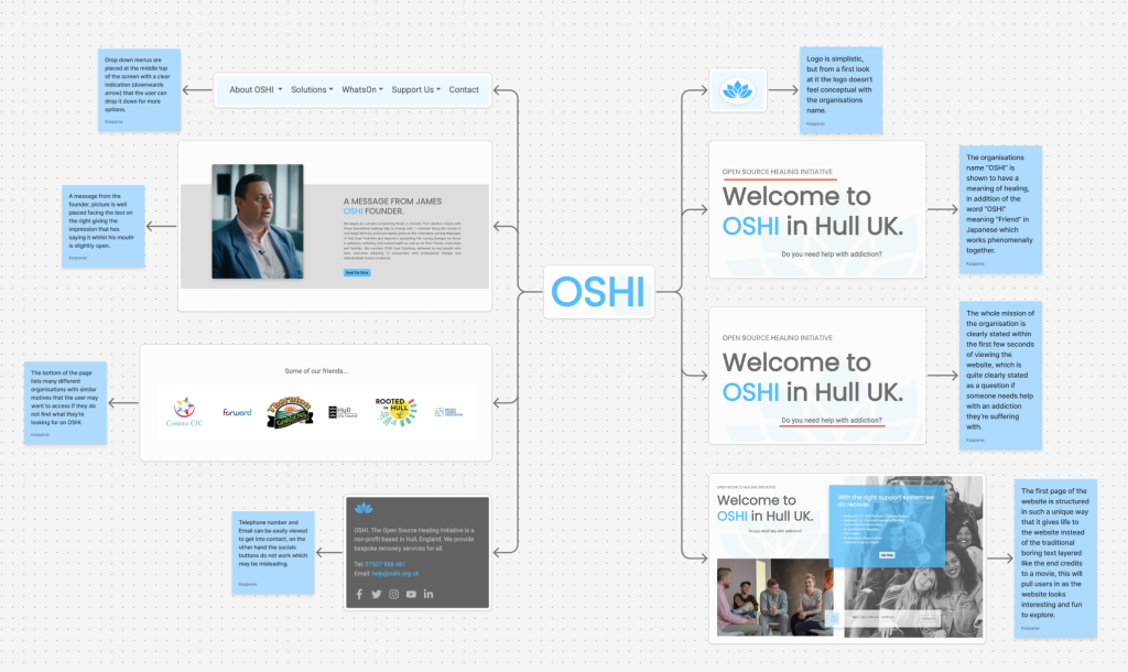
There are a few main positives and negatives that I have accumulated throughout my research to OSHI.
First of all one positive is that the website is very well structured with images placed in perfect positions, this can be seen with the founder of OSHI delivering a message to the users of the website with the image of his upper torso/face facing the text on the right with his mouth slightly open, this gives of the impression that the founder is directly stating that message. Another positive is that the word “OSHI” in Japanese means “Friend” which suits very well with the mission of the organisation, which is to lend a helping hand like a friend and help someone heal throughout their specified addiction. Lastly another positive is that the name “OSHI” is an abbreviation of “Open Source Healing Initiative” which yet again explains their mission straight from the name of the organisation.
On the other hand a negative that has been spotted through analysis is that the website doesn’t have functioning social media button links, once the user is on the bottom of the page there are buttons for social medias such as “X” and Instagram, once pressed they do absolutely nothing which will cause the users to be mislead and confused, this has a possibility of the users clicking off the website as they may think of the organisation to be unprofessional, this can be easily avoided by creating functioning social medias and changing the destination of the buttons to the corresponding social media.
BUTTERFLIES
This is an organisation that primarily focuses on support from people that unfortunately get diagnosed with dementia, with the addition for support of their families. This is done by having the whole family enjoy days out and activities together to make life easier for the families living with dementia. Similarly to Oshi, Butterflies also primarily operates on a website which you can read upon what the organisation offer and why it was created. The style of the website is very fun and colourful, this can be seen with the animations and splash of different colours used across the website.
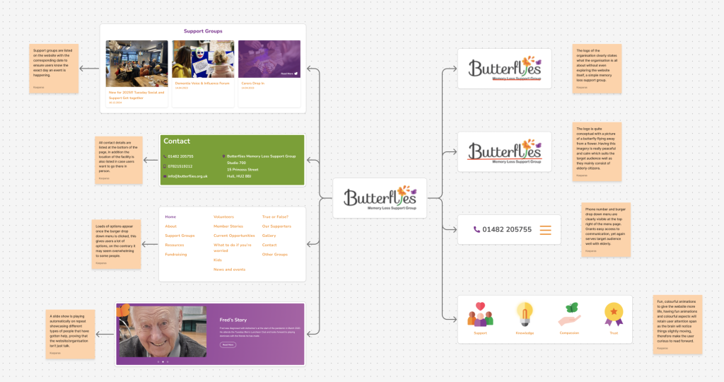
There are a few main positives and negatives that I have accumulated throughout my research to Butterflies.
One positive is the animations used within the website are very fresh and simple, giving the website some life and attraction, having animations like this will retain users as they’ll be intrigued to what other fun quirks the website has. Finally another positive is the location the contact is placed, this is because the target audience of elderly people may not know how to use technology all that well, having a straight up contact show cased within the first second of opening the website helps encourage them to get involved.
One negative of the Butterflies website is, the drop down menu for the different accessibly pages that the user can explore, this is because once the drop down menu is clicked it will reveal 16 whole different buttons for other pages, this may be too overwhelming for the target audience of elderly citizens having them ultimately click off the website. Another negative to the website is that the social media account “X” had been created but it has never been used to promote what the organisation is about, this is negatively impactful as users may click on the social media button and think that the organisation is no longer in business because of social medias being left to rot, this can be easily fixed by simply creating posts for the “X” account to promote the organisations events or changes etc.
The 2 larger organisations are as follows:
COMMUNITY KNOWLEDGE MATTERS (CKM)
“CKM” is an organisation that brings together people that are interested in community based research which is primarily based around Scotland. “CKM” has a website which is mainly used for informing users what the organisation is about, on the other hand they also have an Instagram page with the name “science_ceilidh“, this Instagram page is an excellent way of showing users what really goes on in their past events which ultimately leads to more people being intrigued about “CKM”. Their style is very unique with lots of videos and parallax images across the website.
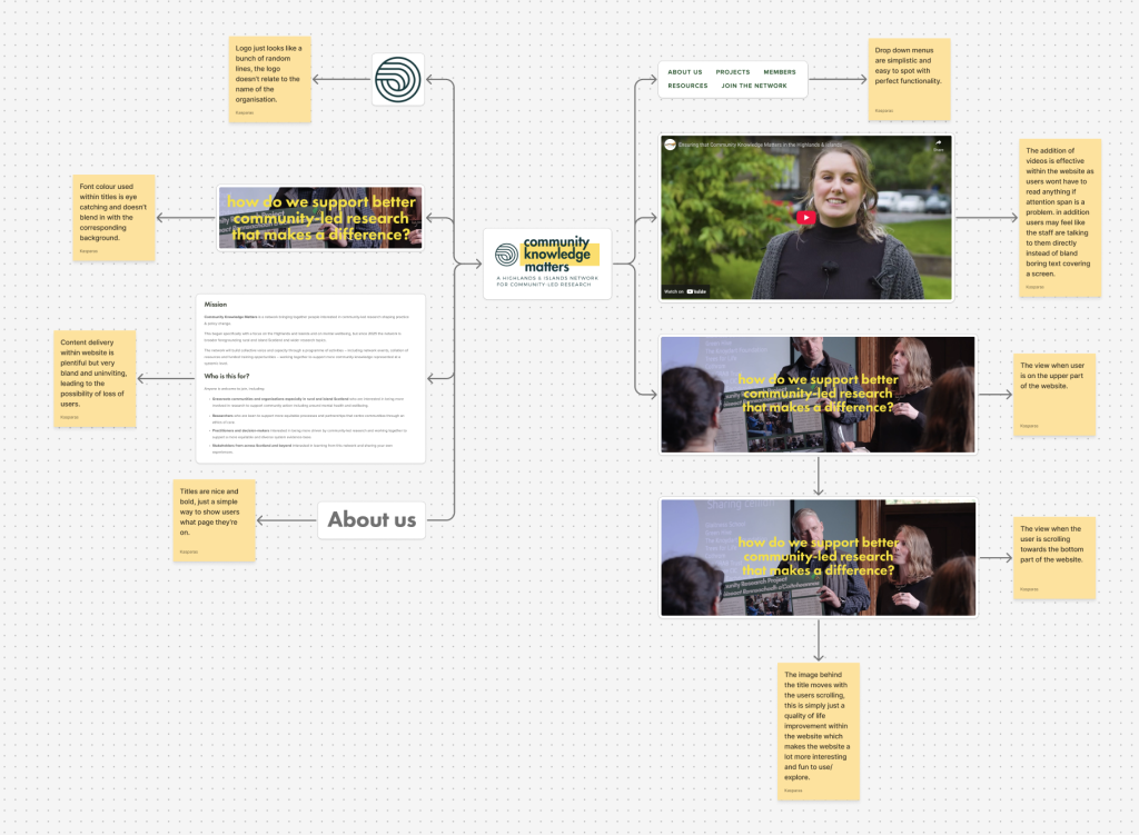
There are a few main positives and negatives that I have accumulated throughout my research to Community Knowledge Matters (CKM).
One positive is the parallax scrolling they have implemented within the website, this makes the website look polished and kept up to date with slight movement, ultimately keeping users attention span. Another positive is the YouTube videos that the website places within the website, this can be seen as a positive as instead of reading boring text, users can press a button to enable a human to talk about the website and organisation, this especially works well with people that may be dyslexic as nothing has to be read ensuring a relaxed mind when learning about CKM.
One negative is the logo, this is simply because the logo just doesn’t mean anything, the organisation is about community knowledge but the logo does not reflect that at all with a few simple lines making it forgettable which declines user retention. Another negative is the amount of text the organisation adds to the website is really off putting, this is because a lot of people don’t want to read hundreds of words placed onto the screen like a text document to learn about a website, an issue like this can be easily resolved with less text and images for user attention.
IMAGINING FUTURES (IF)
“IF” is an organisation that prioritises in creating methods for equality between different groups of people and avoid conflict between different types of groups for the ultimate goal of peace. “IF” uses a website which covers their goal in great detail of how they ensure equality is present within their work. In addition “IF” also uses “X” to promote their mission and post heart warming messages from others that have worked with “IF”. Their style of the website is very minimalistic with bundled text which gives the impression of a wikipedia page.
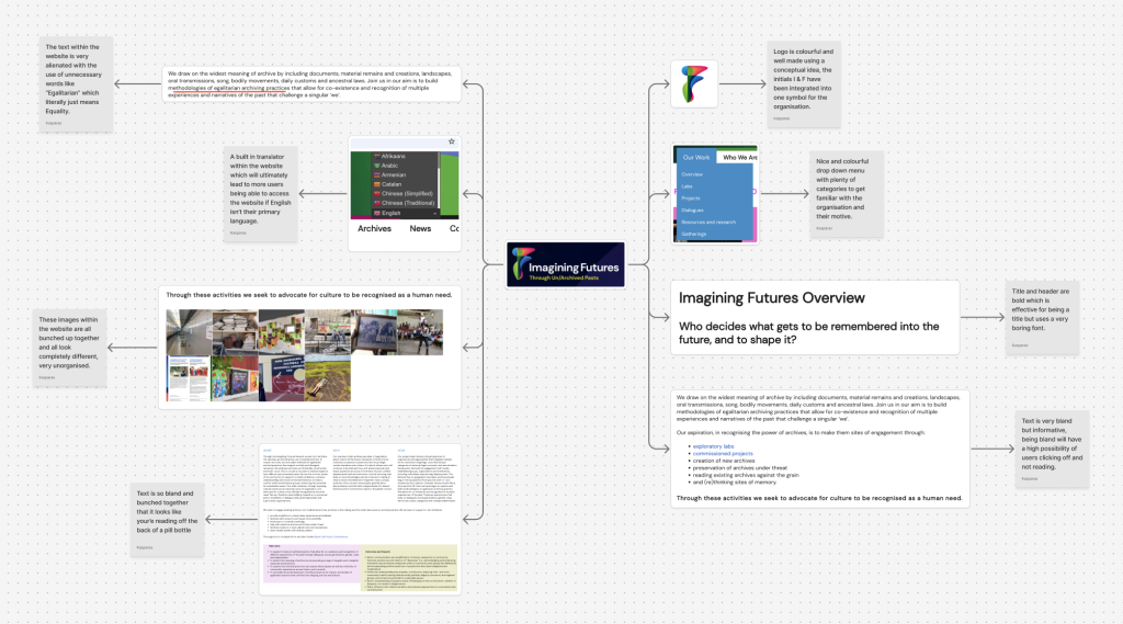
There are a few main positives and negatives that I have accumulated throughout my research to Imagining Futures (IF).
One positive of the website is that it has an in built translator, this is a huge benefit to the organisation, this is because user can access the website and read what its all about without having to understand the English language. Another positive is the logo, the logo is formed from the initials of Imagining Futures which is “I” and “F” into one character, this ultimately makes the logo very memorable and retains user retention.
A major negative to the website is the alienated text that has been inserted within the website, an example of this can be seen in the “Our Work” section of the website where words like “Methodologies” and “Egalitarian” can be used when they could simply just say “Methods” and “Equality”, this will push users away from the website as many people that speak English as a primary language may not even know what these words mean, leading to unnecessary usage of google to understand what is being said that will then finally lead to users clicking off as using the website may seem like a hassle, this can be easily avoided by simply using language that the public are familiar with.
This extensive research has been constructed to ensure that the website for “PC” has no flaws and can run perfectly with increasing user retention.
All website links are located at the bottom of the page to show that research and analysis has not been fabricated
Design Ideas.
The Images listed bellow are the designs that have been articulated specifically for the participatory collective, the reasoning behind the designs have been assessed bellow.
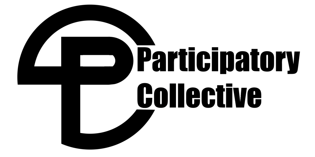
The first addition to the Participatory Collective is the logo. This logo has been constructed very specifically using a singular stroke of a pen, this was done to have a professional look, in addition the logo symbolises that the Participatory Collective is all linked together with a singular line making the impression that all the communities/organisations are linked together with the Participatory Collective as a family.
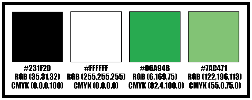
The second addition was to find suitable colours for the website/campaign, the colours black and white have been implemented as a standard colour for text and background. Whilst the black and white colour may seem boring, a green and light green colour have also been selected to give the website/campaign more life and colour. Green has been selected as a colour because, green is typically associated with growth, health, harmony and friendship. With green as the primary colour that the users will gaze their eyes upon it will ensure then that they’re in a safe space/community with the addition of a friendly green colour.
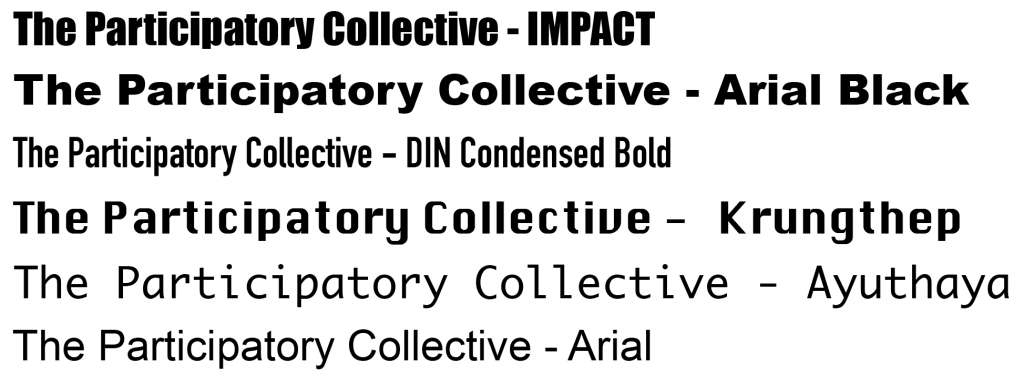
The typeface has been selected, within the website titles and subheadings will use the “Impact” typeface and casual text along the website will use the simple “arial”. This is done simple for the fact that headings will stand out very easily with the bold typeface grabbing users attention to the page. On the other hand, “arial” has been used for casual text for the fact that it easy to read when bunched together, unlike “DIN Condensed Bold” which has a very tightly condensed font which may be hard to read for a lot of users, especially users with dyslexia. “Impact” has also been used in the logo as it makes the logo stand out more, making it more memorable.
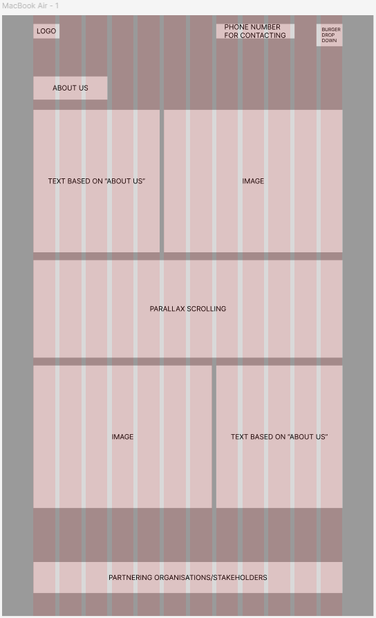
Finally the low fidelity website for the home page has been constructed with images and corresponding text, with the addition of parallax scrolling to give a little motion to the website. An easily accessible contact phone number has been added to the top right of the screen so users can get into contact easier. A burger drop down menu has been added to the top right for the main navigation of the website to avoid a cluttered screen. Lastly a bar at the bottom of the page will be set to show the organisations that the Participatory Collective is working together to bring attention to all groups like a family.
Early Experiments.
A few early experimentations have been listed bellow.
This is the early phase of the logo, the only thing that changed is the singular curve at the bottom left, this has been taken out as without it, it looks a lot more appealing and professional.

Many different typefaces have been looked over but eventually settled with the “Impact” and “Arial” typeface. This is because the other typefaces have flaws such as “Krungthep” and “Ayuthaya” having large spaces between characters which looks very unappealing in large quantities.
Stakeholders.
There are many stakeholders to take into consideration within the Participatory Collective which will be listed bellow.
Community Organisations are all about being visible to the community and having their voice heard, this can be done by having videos and community photos within a dedicated page. Another way their voice could be heard is with their “call to actions” that are based on sharing their story, joining the community forum and the addition of a project.
Academics and Researchers are all about changing systems and cultures for the collaboration with the communities, this can be done by adding interactive visual elements within the website of the community research journey. Another way is with a few “call to actions” such as, finding and building up relationships with community partners, exploring and sharing the research tools, and downloading case studies that would be shared among the community. Ultimately all these link to having a stronger bond between all cultures as resources and information is shared equally.
The Funders are all about funding the campaign and website whilst working equitably with communities and researchers, this can be shown with clean data to download, as the funders want to be shown exactly what they’re funding and that nothing is being overlooked and done behind their back to extort them. Another way is with a few “call to actions” such as, the download of reports to see where funds are being traversed through, see the funding outcomes to show that the funds are actually helping and aren’t being wasted. This will ensure that the stakeholder will gain trust in your project which would benefit the Participatory Collective in the long run if any other projects need to be funded.
The last stakeholder is the Policy Makers and Local Authority, just like the Funders, Local Authorities will also have to be show clean data, this is simply because they want to view what the money is being spent on/what events are being run, to see if the Participatory Collective is staying within the law to avoid trouble. Another way is with a few “call to actions” such as, viewing the system change maps and downloading policy briefings, this is done to summarise issues and offer policy recommendations within a few simple pages for non expert audiences.
Ethical and Exclusive Designs.
The design that will be constructed will reach many ears and share many voices through many aspects such as; the organisation being ethical, the website being easily accessible and to be able to achieve sustainability with low energy usage. Ethicality, Accessibility and Sustainability goals are mentioned bellow.
The ethicality of the website/campaign will be easily seen with respect towards the users, this can range from correct vocabulary used within the website instead of alienating it, this is done as the users may think that the creators of the website are acting smug with their advanced terminology that no human uses on a daily basis. Another way ethicality can be shown is to avoid creating the website in the mind of generating as much money as possible, an example of this is the use of Bitcoin miners and selling personal information to data brokers, this would betray the trust of the website the second its been found and made public.
The accessibility of the website will be seen the second the user will open the website with the addition of a burger drop down menu and easily accessible contact details. A burger drop down menu will be created for all of the websites pages to be accessible with the press of a single button, this is done to allow the users to navigate to which ever page interests them the most, this ultimately creates a positive user experience which will lead to user retention. In addition an easily accessible contacts page will be implemented, this is for the sole reason of the users to be able to ask any questions through live customer service and proceed with any projects that the users may come to “PC” for.
The sustainability of the website can be easily implemented, this will be done by having a small but efficient website, image compression and using green hosting. A small website will be done by only implementing important pages that the users will find useful. Image compression will be done by lowering the quality of images ever so slightly to save energy costs. Finally, green hosting will be used, this is where the website is hosted through sustainable energy sources like solar panels to reduce the websites carbon footprint. Having a sustainable energy website will eventually lead to users feeling good about using the website as it is doing practically no harm to the planet, this will ultimately lead to a positive user experience.
Campaign Goals.
Once the website and campaign are completed and fully operational, the achievement I will be aiming for is for the website to have a phenomenal user interface and user experience, to then retain users with a positive outlook about the website and its campaign with additions like green hosting and ethicality. Within the launch of the website and campaign it will include many aspects such as parallax images and dynamic structures, this is done to grab the attention of the users and keep user retention. The website will work by grabbing the attention of the users from the homepage with the mission of the campaign, an artistic logo and a creative design to bring some life to the website, this is done to avoid the website from becoming a text based website which eventually will lead people away purely out of boredom which would decrease the overall usage of the campaign.
References
James Halls (N.A) OSHI. Available online: https://www.oshi.org.uk/ [Accessed 25/10/2025]
June Cooke (2010) Butterflies. Available online: https://www.butterflies.org.uk/ [Accessed 25/10/2025]
Lauren Pyott (2025) Community Knowledge Matters. Available online: https://www.communityknowledgematters.com/ [Accessed 25/10/2025]
Elena Isayev (2020) Imagining Futures. Available online: https://imaginingfutures.world/ [Accessed 25/10/2025]