Within this post I will be showing off my wireframes with explanations on why certain areas have been created, with their purpose and impact on the users. I have created 6 wireframe layouts for my website which will be listed and shown bellow. Within he 6 wireframes I have annotated everything on the page with the addition of why this is used, this can be seen within the images.
(Click wireframe images to enlarge for clear letters)
Homepage:
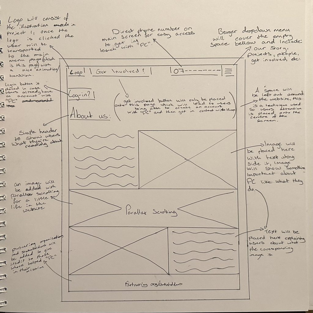
The main way the user will move throughout the Homepage is by reading the “About us” section of the website, once they read what “PC” is about and are interested the user will press the “Get Involved” button to sign-up. On the other hand if the user is still conflicted whether to join or not they may press the burger drop down menu on the top right of the page to then navigate to any of the other pages that will be talked about bellow.
Projects Page:
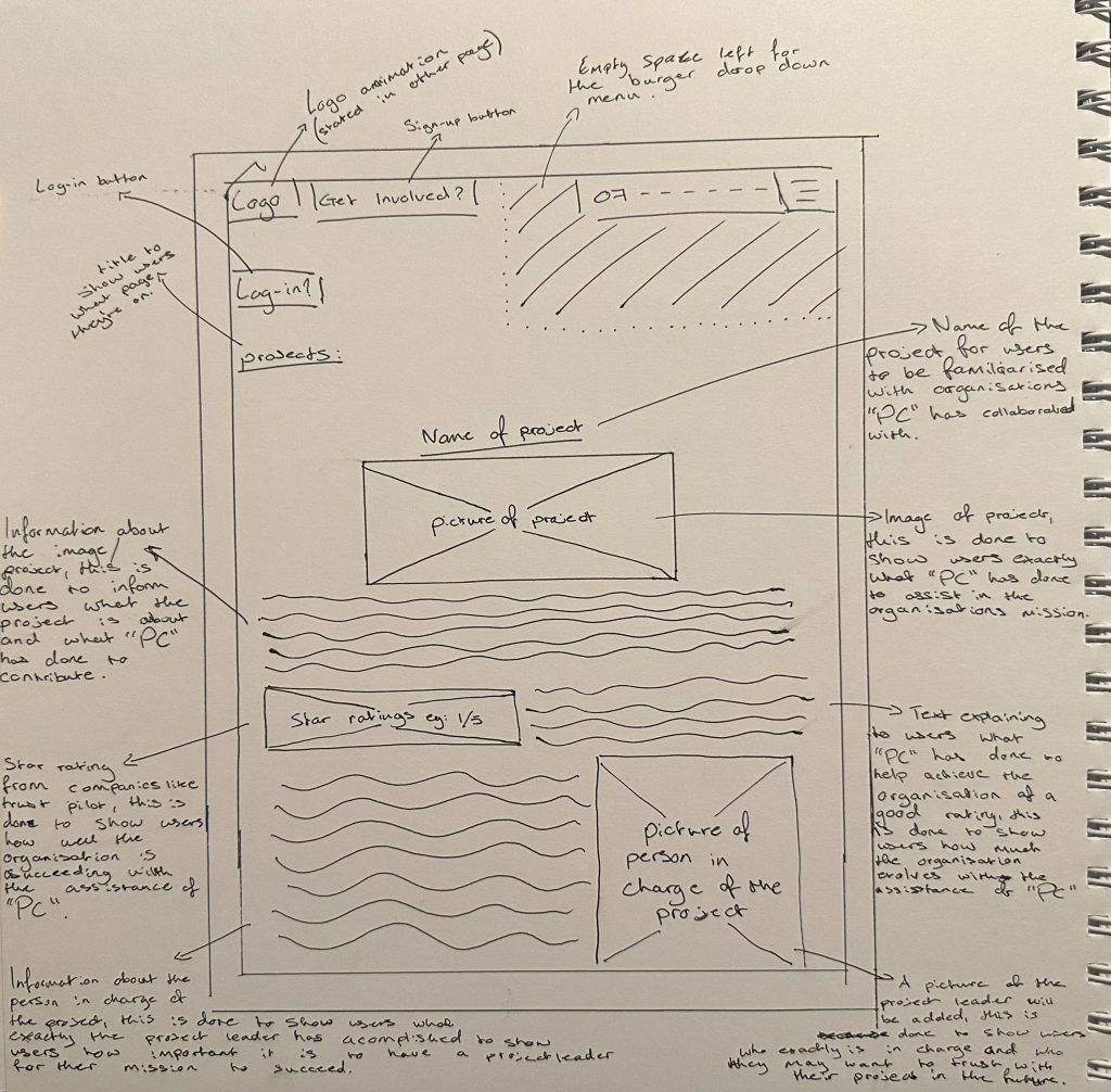
The main way the user will move throughout the Projects Page is by scrolling down and reading the many different projects that “PC” has been apart of with the addition of a star rating given to that project by trust worthy companies that review organisations, a picture of the project leader will be inserted too for the users to understand who excels in what category.
People Page:
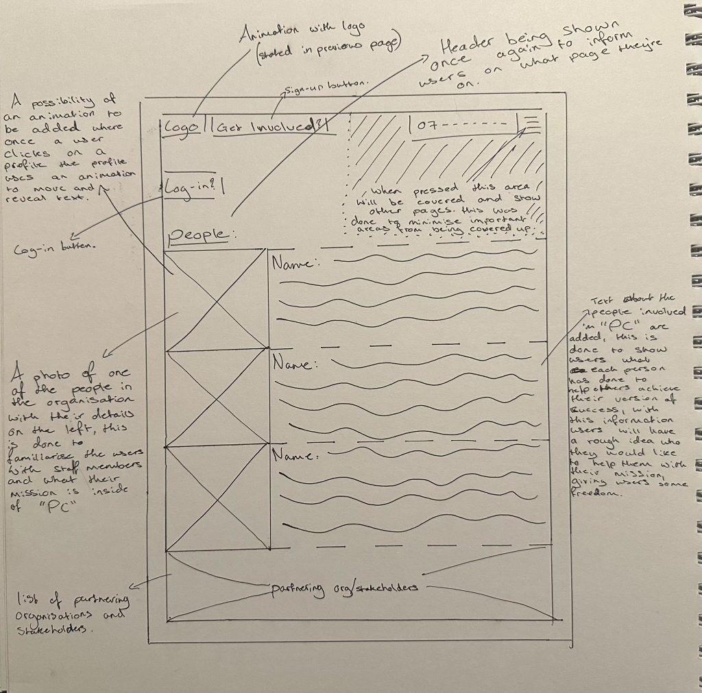
The main way the user will move throughout the People Page is by yet again scrolling down and reading upon the different types of staff members that have helped other organisations to achieve their mission, the users will have a rough estimate of who they may want for their project by reading the information listed next to the picture of the staff member which will explain what each staff member is good and bad at.
Log-in/Sign-up Page:
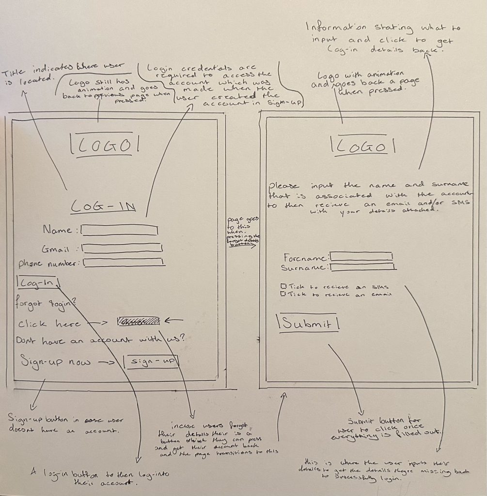
The main way the user will move throughout the Log-in Page is by simply entering their log-in details to then get in touch with “PC” easier. In addition there are 2 more buttons, a sign-up button which will lead you to the “Get Involved” page (which is seen in figure 4) and a forgot log-in button which will then transport you to the page on the right to then retrieve your details via SMS or email.
Placements:
ultimately the placements of each part of the website ensures the website maximises on user retention and attention. This is done with a few things such as the phone number being listed on the top of the screen in every page (apart from the log-in pages), this idea was taken from the research I conducted for other websites within my previous posts, the phone number is placed here so users have a direct way to contact “PC” as soon as they open the website which brings more person to person communication, therefore leading to a positive user experience. Another example of good placement is within the burger drop down menu, an empty space is bellow the menu to ensure once its opened that empty space is taken up and any vital information isn’t, this is done to ensure the users are not missing out on any information that may convince them to join “PC”, therefore increasing user retention. Lastly the “log-in?” and “Get Involved” buttons are located at the top of every screen to encourage users to create an account or log-in to their already existing account to then be able to swiftly contact “PC”, the buttons have been located at the top of ever screen to ensure the user sees them and once they’re done exploring the website they can instantly sign-up ensuring a larger amount of possible clients.