The layout of a website is very important to any visitors as it may determine if they will continue viewing it or click off. Within the website it should give the viewer a clear idea of what your brand represents and what genre the product will be.
For this section of the assignment I chose to construct 4 web pages promoting 3 different horror games and a main menu, in which the user can select what game they wish to view information about such as the story and characters or overall information about the game. Once I open Adobe Illustrator I created the page 1920 x 1080 pixels as this is the standard screen size that monitors use, this links to my target audience as the target audience will mainly consist of people playing games on their personal computers.
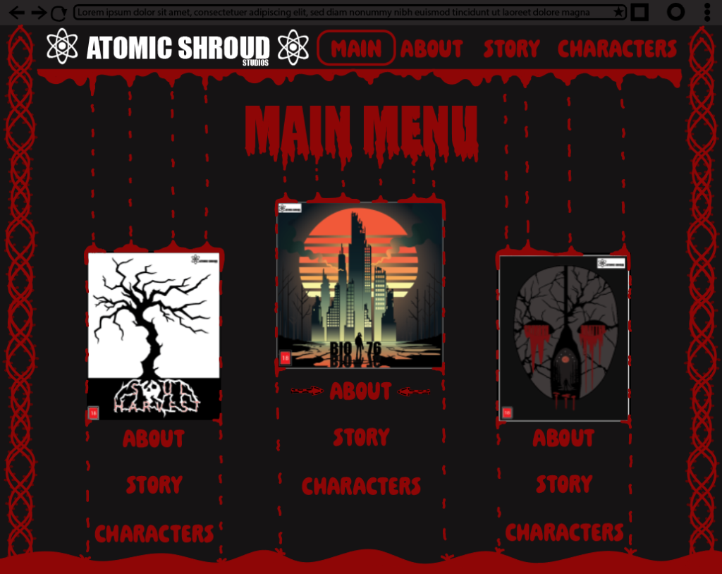
the main menu webpage (Figure 1) was constructed as a lobby for all released horror video games that the viewers can freely read upon before purchasing the video game, this is done so the customer does not buy a game they potentially may not like. A small detail about the main menu is the arrows that flicker once the mouse is hovering one of the 3 information options (which can be seen under the “Bio 76” cover near the “about” section). Composition was used in the main menu with the covers as the top seller is enhanced in scale in the middle of the page whereas the less popular games are put slightly to the side to dictate the main focus to the gem of the company.
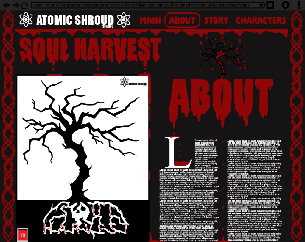
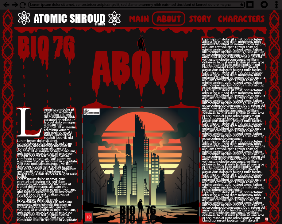
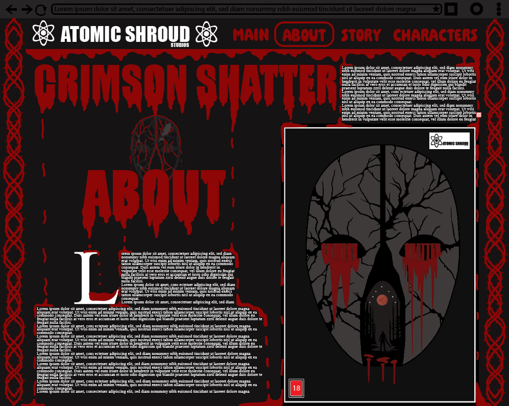
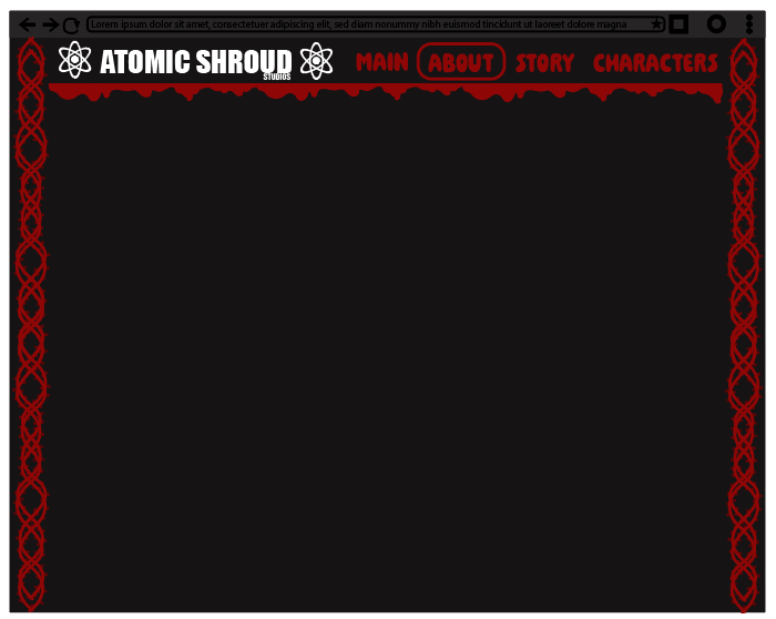
Colour has been effectively used in all 4 webpages with the vibrant red colour and the blood drips under the titles. This is because as the blood drips down from the titles it may hit the paragraphs with all the text, once it drips down to the text it flows around the text to make it stand out to the viewer and highlight the important information in the webpage. On the other hand Lewis Wainwright provided me with key information about the location of the logo, he stated “try add it near the top left where the other subtitles are” which I have done as its a good placement and rests nicely along the top. Within the top of the page there are sub-titles reading: About, Story and characters, once a section is selected (in this case the “About” section is selected) a ring from the logo appears around the section the viewer is currently on. Lastly the illustration I have created is being used on the far left and right side of the page and as the user scrolls down it increases in length until the bottom of the page as I wanted to add something looked dangerous and sharp which links to the blood dripping from the top.