One of the most important things about a video game is undoubtedly the cover design, this is purely because people will look at it and decide right then and there if the video game is worth the purchase leading to unique designed being constructed bellow.

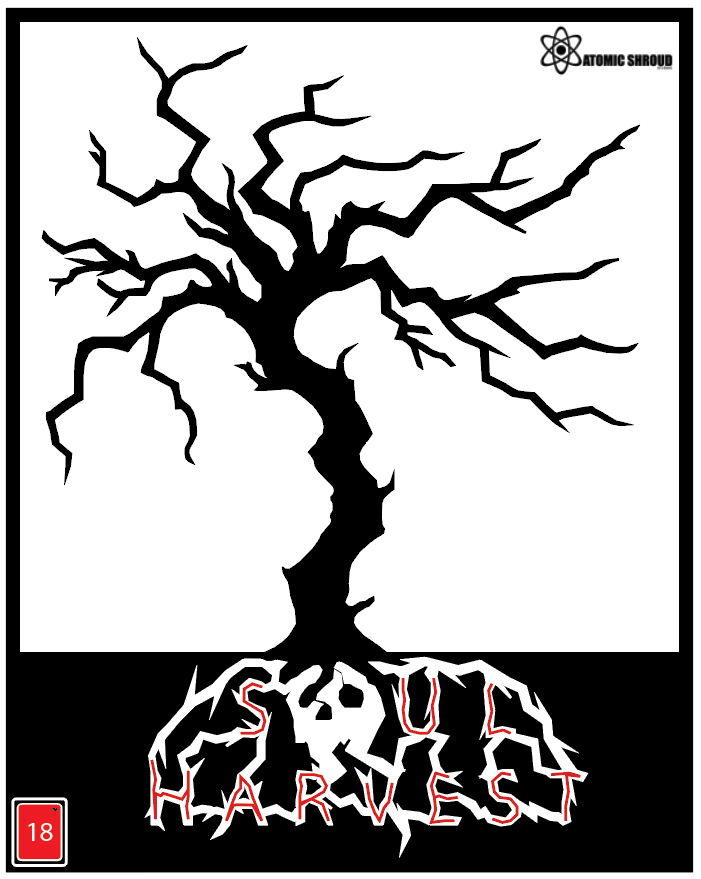
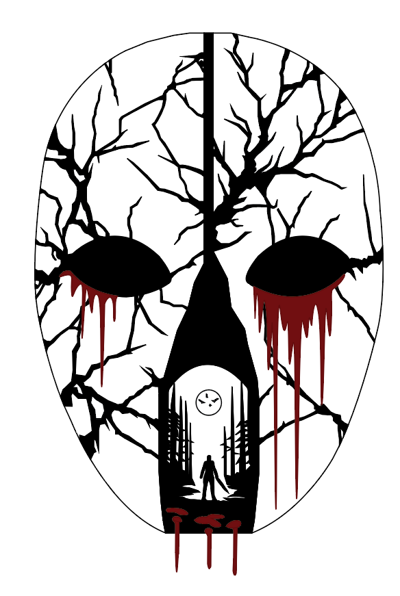
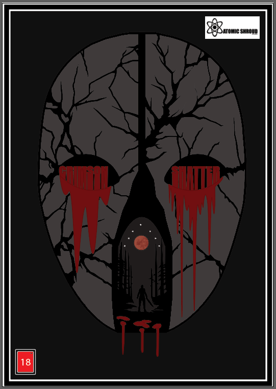
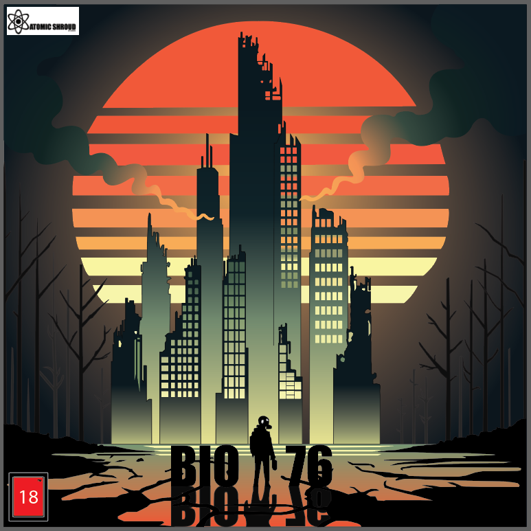
The cover designs that have been created are done with conceptual designs for example, “Soul Harvest” (Figure 3) the roots have created the titles name and a skull which replaces the “O” in “SOUL” as a skull closely resembles the letter “O”. Secondly colour is being used effectively in all completed covers (Figure 3, 6 and 9) as previously stated one of my primary colours is red and red is clearly used in all 3 covers as a significant colour which stands by my brand identity strongly. On the other hand the “Impact” typeface is used in my covers (Figure 6) which links back to my logo as the primary typeface used in my logo is “Impact” which links to the covers as they use the same one. Lastly composition is effectively used in my cover designs for example in “BIO 76” (Figure 9) this is clearly seen by the tall buildings in the back in front of the sun with the main character looking back at the viewer encouraging the viewer to embark the journey to the city with them.
Within all 3 finished cover designs (Figure 3, 6 and 9) they all work well with my brand identity as I focus on having a horror video game theme, for example BIO 76 (Figure 9) is in the horror game genre as its based on a post apocalyptic scenario. In addition Crimson Shatter (Figure 6) is about a killer with a bloody mask which yet again fits with the horror theme which then links to my target audience and the 18-25 age criteria.
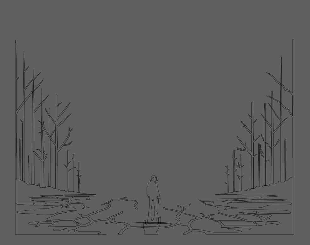
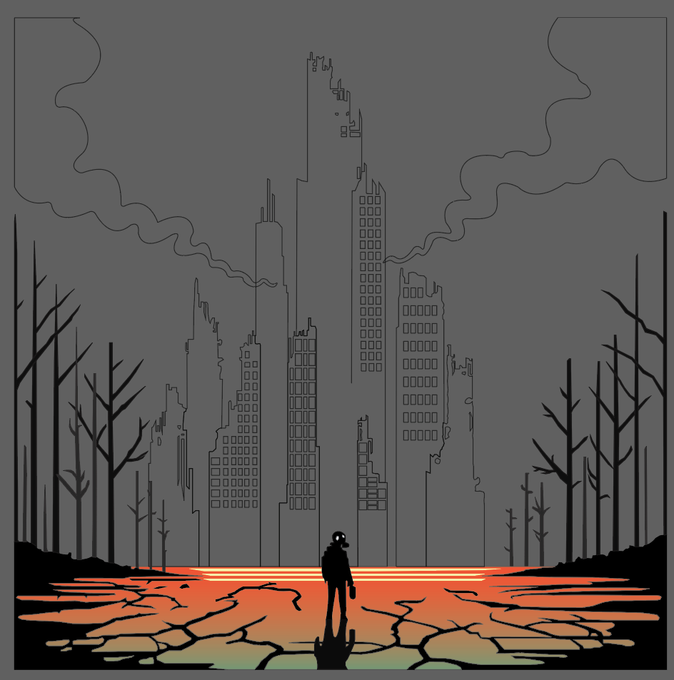
Lastly, Yao Wenbo recommended that I take screenshots of my work partially throughout creating which he stated “It would look very appealing and it shows the progression of your work and the overall originality of the work leading to a product that stands out from other competitors”.