Introduction.
Within this post wireframes, low fidelity and mid fidelity designs for a mobile application for Cab-E will be constructed, this will be done in ways to support UX and UI for retention of customers.
Wireframes.
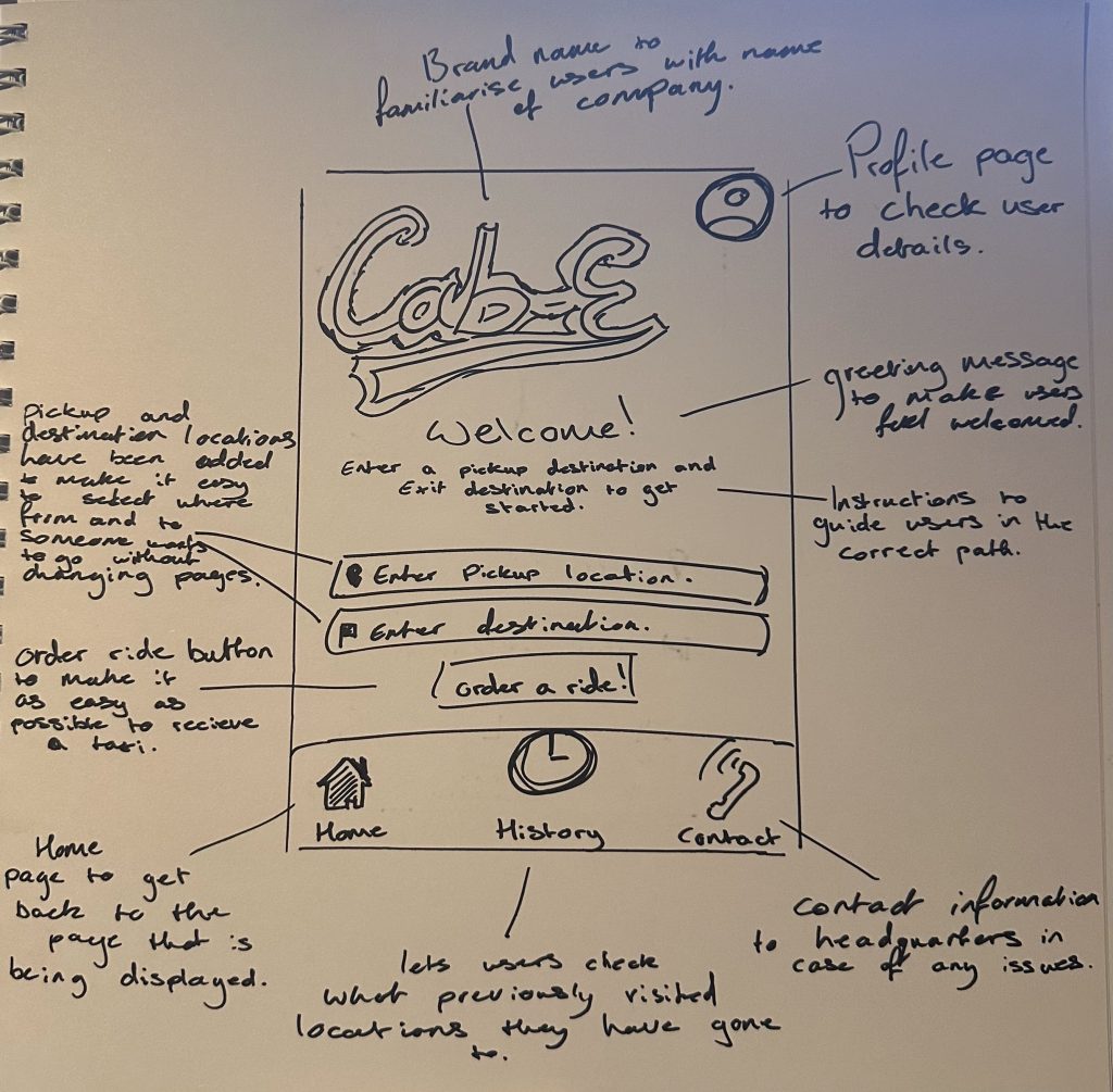
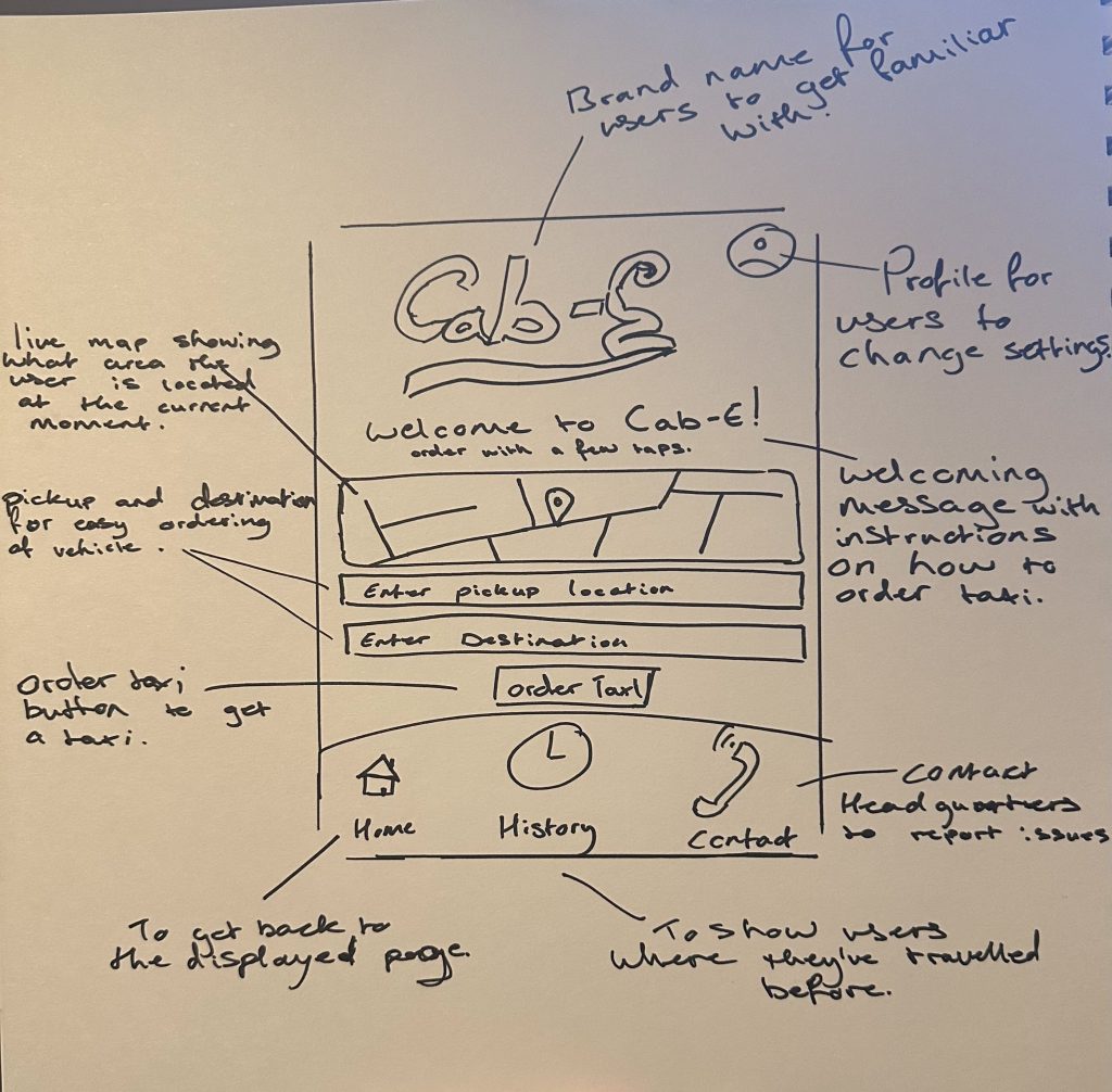
These 2 initial wireframes will demonstrate how the application will be laid out with a few features and reasoning listed bellow:
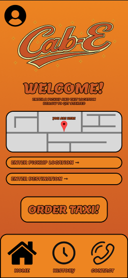
- Logo – Will be placed at the top for users to get familiarised with company identity.
- Toolbar – A toolbar is located at the bottom with Home, History and Contact for easy navigation between contacting Cab-E for any issues or checking the history page for an insight of where the user has travelled before.
- Welcome – A message to make the user feel welcomed.
- Insert – 2 Insertion boxes for users current location and later destination with a box to order taxi as fast as possible to not waste users time.
Low Fidelity.
The low fidelity illustrations above have been crafted to make it as simple as possible to order a taxi for users to get from point A to B in as little time. Figure 3’s layout will be the primary layout chosen to be moved forward to the mid fidelity section as it covers the page nicely without being overwhelming.
Mid Fidelity.
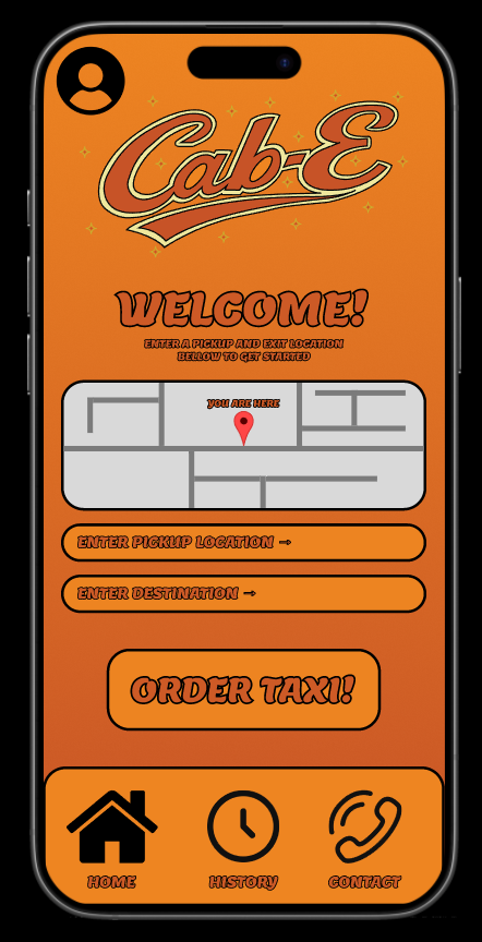
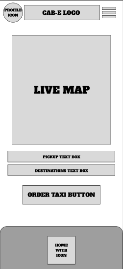
Within the creation of the mid fidelity mobile application, colours, logo and typography have been inserted to show roughly how the application will look without being production ready with working input buttons. Furthermore, an additional image has been inserted which can be seen in Figure 6 to show how the app looks on a mobile device.
Firstly, the logo has been plastered clearly at the top of the screen to have users be familiarised with who they’re traveling with, which also makes it easier identifying the correct vehicle once its arrived.
Additionally, a simple welcoming message with instructions have been written to make users feel welcomed and guided, which then improves the overall user experience as users will not be confused when navigating the app.
Many components within the main page have been altered for a refined user interface, this was done by having a smooth gradient colour fading from a sunset orange to a lighter yellow to imitate the core colours of a taxi. Additionally, text boxes and buttons have been set to specific sizes and locations by using layout grids to ensure they’re not out of place by even a single pixel for aesthetic purposes, leading to a visually appealing user interface.
Furthermore, the typeface and colour used supports the vintage taxi company that the brand is building, which this mobile app will further enforce and empower the brand identity.
Overall, this design strongly supports the brands goals of having an easily navigable mobile app with all the core features of ordering a taxi displayed on the front page, this ultimately increases the user experience as it saves users time, leading to ordering a taxi as quick as possible.