Introduction.
Within this post 3 Logos have been illustrated for “Cab-E” with early sketches and annotations to support decision making. The PDF files bellow have been exported to a digital version and print version with the use of RGB and CMYK colours.
Early sketches.
Early sketches of 3 logos have been constructed above with annotations specifying what will be added and why.
Logo References.
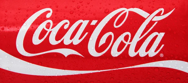
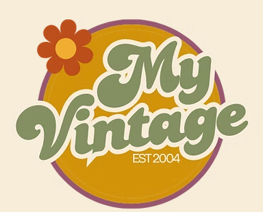
Inspiration from the 3 logos that I have constructed came from the 2 logos above in figure 4 & 5, within the logos I have created I used a vintage font with curves and lines overlapping with characters. This can be clearly seen by viewing Figures 4 & 5 with my “CAB-E LOGO 3 & CAB-E LOGO 3.5.
3 Illustrated Logos With Digitalised and Print Versions.
Cab-E logos number 1,2 and 3 are the digitalised versions of the logo with the RGB colour format, width and height have also been pre-set to 150 pixels. On the other hand Cab-E logos number 1.5,2.5 and 3.5 are the print versions of the logo with a CMYK colour format, width and height have been pre-set to 720 pixels.
The brand name is written very clearly along the 3 illustrations, this is done with good use of a stroke tool, when dealing with a 720 pixel image its quite easy to read the brand name, on the other hand a digitalised version can be tricky as it uses less pixels, this is why a stroke effect is used to make the name pop out.
The logo effectively projects the brands service as the brands name is clearly a reference to “cabs” which holds the meaning of being picked up by a car and traverse to a location in exchange for a currency.
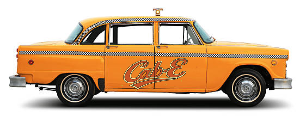
Finally the image above demonstrates how the logo will appear when placed onto vehicles, within the image the logo is very visible and customers can easily recognise the vehicle they ordered within the mobile application. Additionally, when the logo is placed between door frames it is still recognisable, meaning the logo doesn’t have to be crammed onto a single door frame and can easily spread across the vehicle, ultimately keeping its brand identity intact.
Chosen Logo.
The logo I have chosen for Cab-E to inherit is the “CAB-E LOGO 3 and CAB-E LOGO 3.5”, this logo has been chosen for many reasons such as the style, function, identity and purpose.
My reasoning for Cab-E inheriting this logo is based on its simplistic yet creative approach, the logo contains the name of the brand with a slick ribbon underlining the name with an addition of twinkles for aesthetic reasons. This functions very easily as the brand name will be recognised for its unique approach in design as very few companies use this fun vintage style, and instead use boring, soulless and corporate designs, which will ultimately lead to Cab-E having a well known identity.
References.
Deposit Photos (2025) coke-logo. https://depositphotos.com/photos/coke-logo.html [Accessed 13/12/2025].
My Vintage (2025) vintage clothing. https://www.myvintage.uk/?srsltid=AfmBOoq1n6OqR6TE__5t49_GRsBCk_PAmZTpOHvjVof4IaiPXBYedBnB [Accessed 13/12/2025].