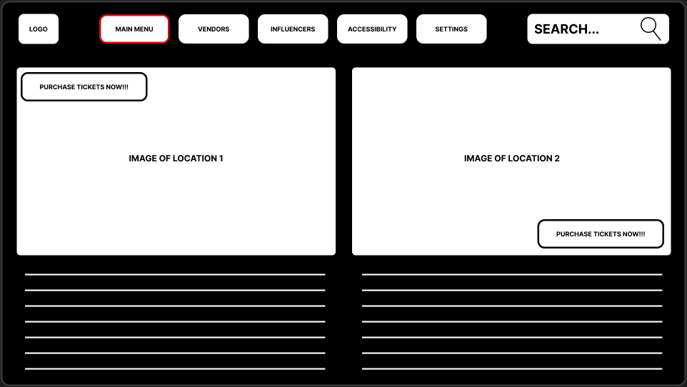
Post 1 will be all about improving the user interface and experience within the website. Research was conducted within post 3 and 4 to better understand my users, with the user feedback in hand, changes to the website have been made which can be seen bellow. Additionally, research from this post was conducted on 25 randomly selected users.
WEBSITE DESIGN

USER RESEARCH FOR WEBSITE
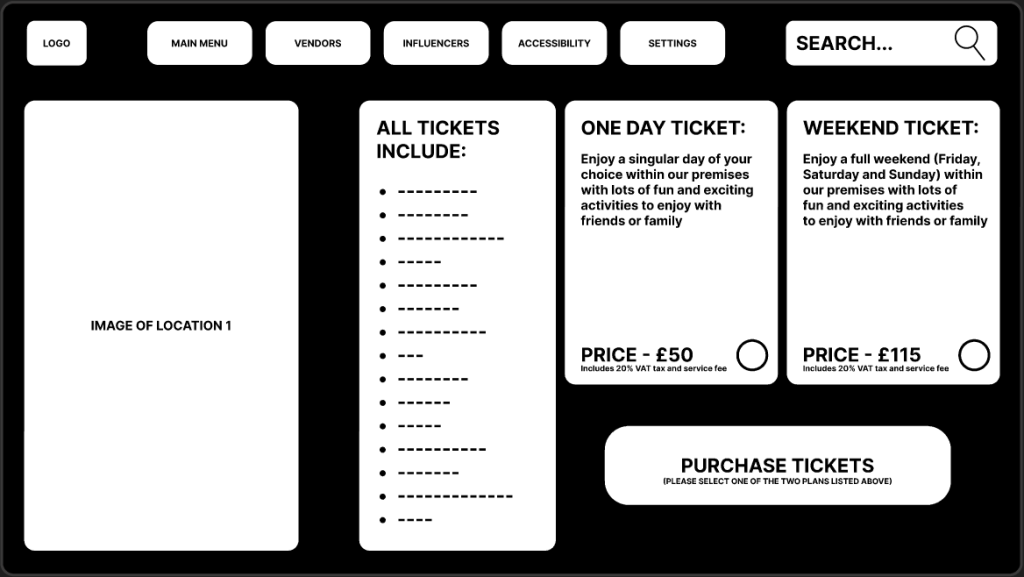
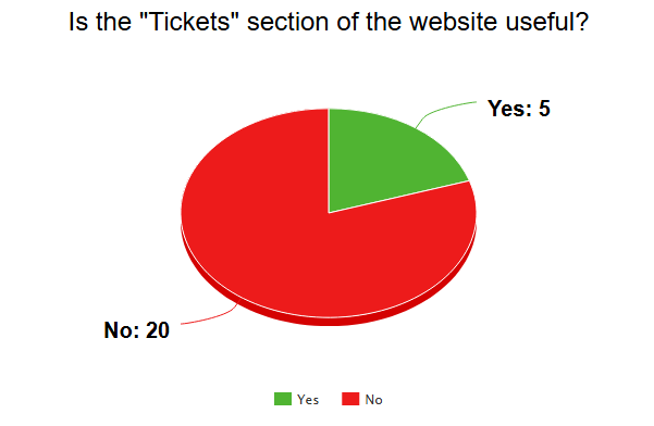
The first step to improving the website was to remove the “tickets” button from the left side of the screen and move all of the buttons to the top as they sit nicely with the logo and the search engine. The tickets button was removed for the sole purpose of it being useless, this is because once a ticket is purchased the ticket will be sent to the email, phone number or mobile companion app. Additionally my users have claimed that the tickets button was not worth having which can be seen bellow.
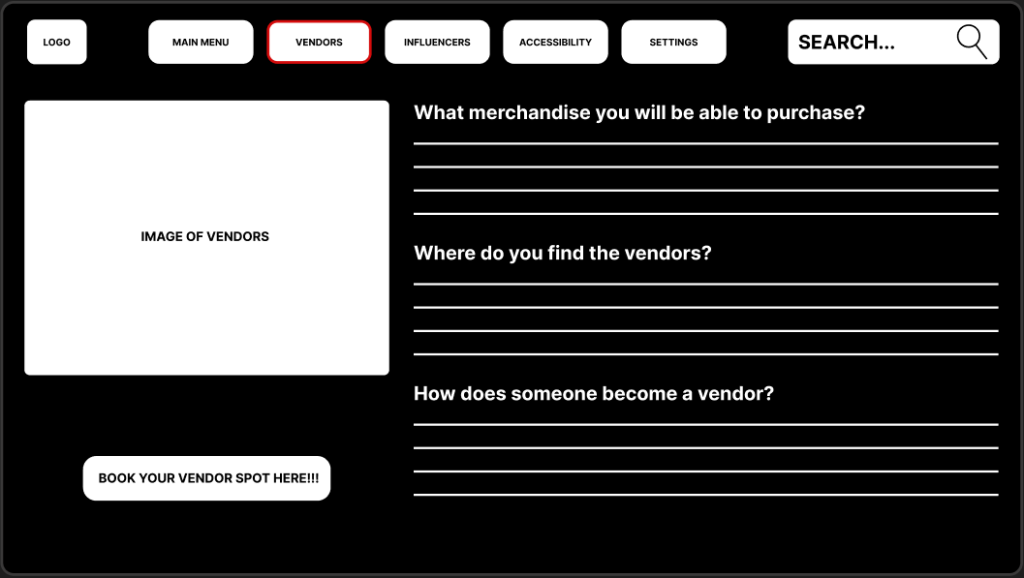
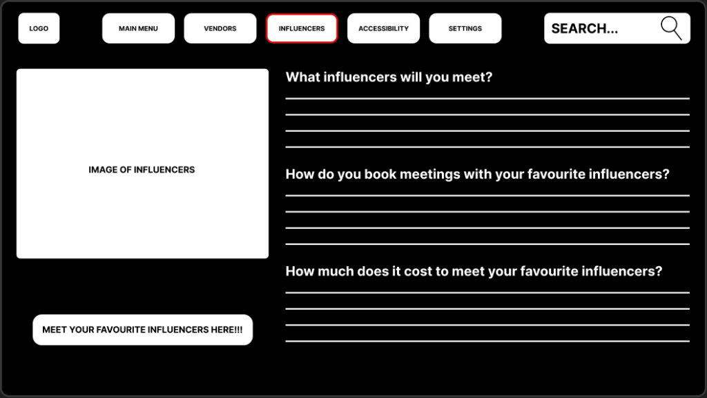
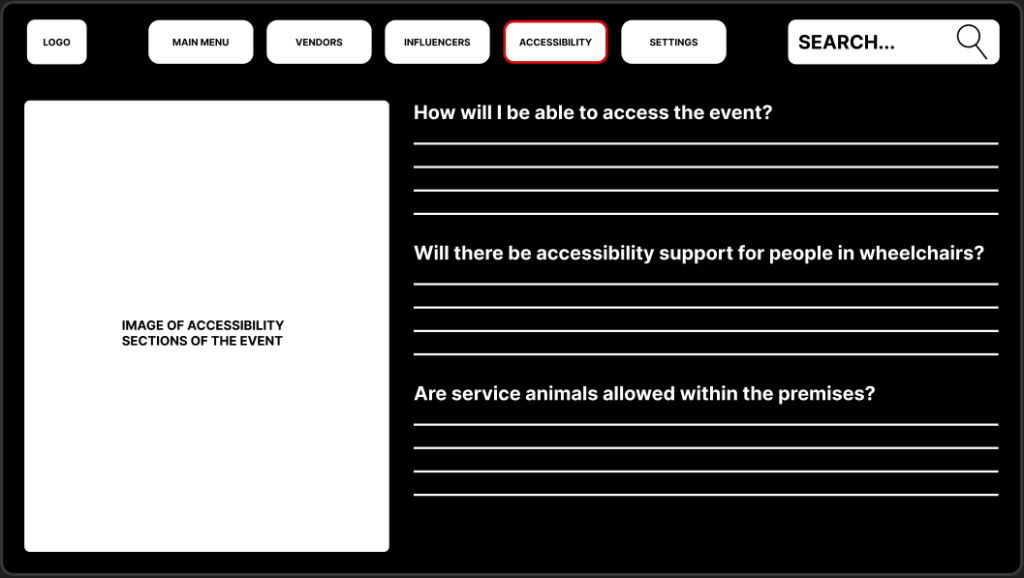
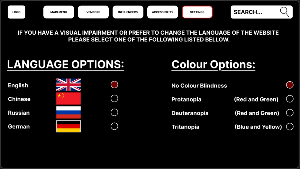
The second major change to the website was the colour as it went from being a full red website to a black/white with a touch of dark red (the user research for this was conducted in post 4).
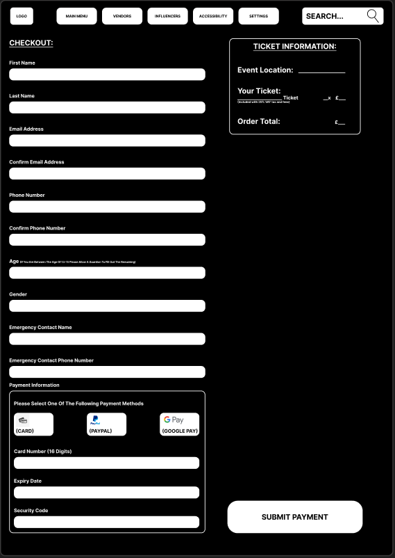
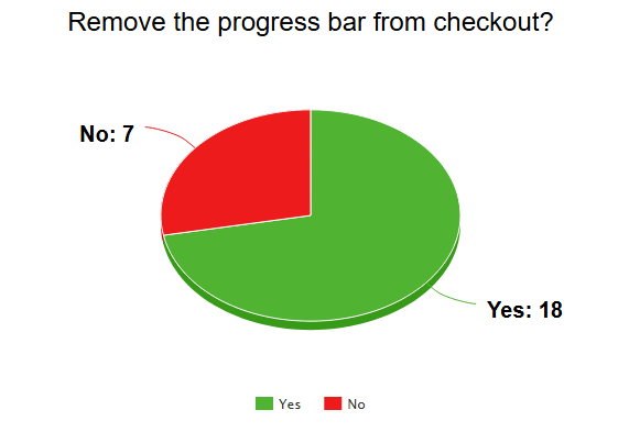
Another major change to the website was the removal of the progress bar from the checkout page, this is because users have stated that it was an annoyance going from one page to another to fill in more details instead of everything being already there for them in one page. According to Bill Gates (1999) “Your most unhappy customers are your greatest source of learning.” which was stated in his book “Business @ the Speed of Thought”, this helps understand that all feedback from users is purely beneficial towards the creation of a flawless website. Once again the pie chart for the question is viewed bellow.
LAYOUT GRID FOR WEBSITE
Finally, the last step to creating the mid fidelity website was to improve the user experience, this was done simply by adding a layout grid for all of the pages which can be seen bellow. Additionally 13 columns were created with a margin of 45 and a gutter of 35 to ensure everything sat nicely across the website. Creating a layout grid ultimately increased the user experience as everything looks set in place properly and tidy.
References:
Bill Gates (1999) “Business @ the Speed of Thought” Available Online: https://www.amazon.co.uk/Business-Speed-Thought-Succeeding-Digital/dp/0446675962 [Accessed 09/04/2025]