Introduction.
Within this post A High-Fidelity Prototype for The Participatory Collective has been constructed using Figma. Navigation, Structure, Accessibility and interactivity will be demonstrated and explained upon.
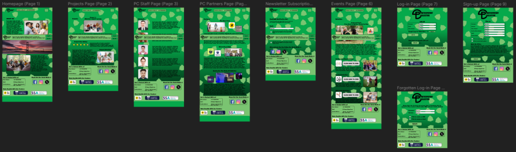
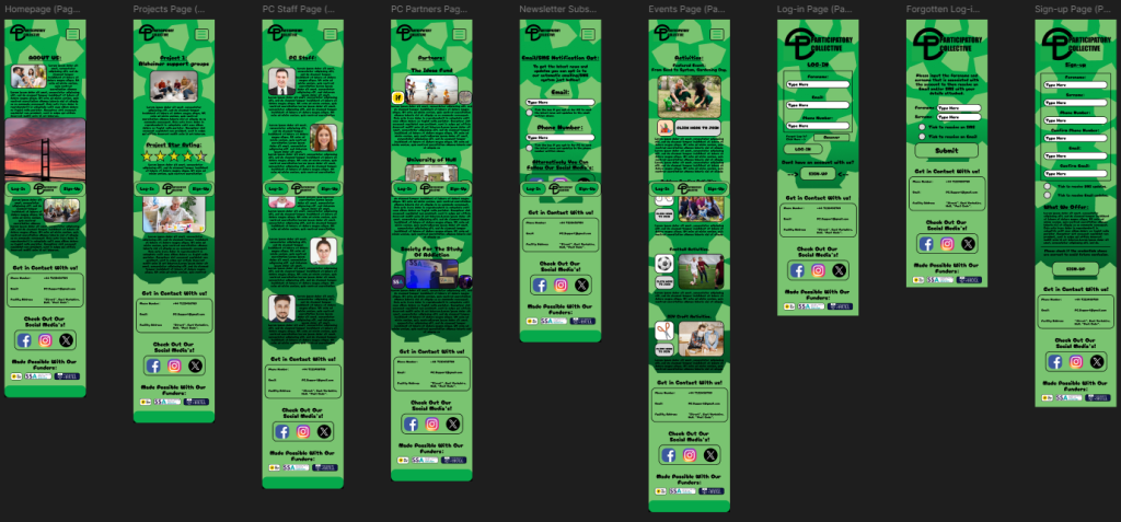
High Fidelity Prototype (Desktop and Mobile Version).
Click Here for a manual overlook of the prototype (Web).
Click Here for a manual overlook of the prototype (Mobile).
Within the prototype the navigation is very clear, an outcome where a user may get lost is highly unlikely, this is because a burger drop down menu is placed in the upper right corner with all the pages listed once clicked. On the other hand, the login and signup pages are not in the burger drop down menu, this is because they have their own specialised place in the CTA bar that follows each page convincing the user to login or signup.
Additionally the structure within the prototype is very clean and organised, this can be seen with images that have a nice black outline and adjacent text explaining what’s being shown within the image. An example of clean structure is within the events page, this can be seen as a featured event is much larger with additional text compared to the smaller events/activities that can be seen bellow clearly outlining what most users should pay attention to.
Accessible design can be easily viewed upon the prototype, one example is the transition animations that have be created whilst switching pages, a swipe motion has been created to give the website a smooth aesthetic. Another example is the colour contrast used, a darker green colour has been used as the background with animated shapes that spin with a lighter green colour to give the website more life, the colours used have been imported from the research phase to show consistency throughout design. Additionally a hint of black has been used on the bottom of the page to add more depth and have the users focus on the centre of the page. All of these colours are suited together as they blend in together and don’t distract the user from digesting the displayed information.
Finally, interactive elements have been created which can be seen with changing colours whilst hovering buttons, interactive check boxes for the newsletter page and interactive text boxes that can also be seen in the newsletter page. These have all been added so the website can be physically used for personalisation with the tick boxes that when ticked will send regular updates to the users email.
(All images of people have been downloaded legally from freepik)