Introduction.
Within this post branding elements such as font choices, colour palette and image direction will be portrayed within web and mobile versions of the prototype.
Font Choices.


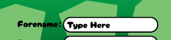
Within the prototype web and mobile version one font has been primarily used called “Cherry Bomb” (can be viewed in figure 1 and 2). This font has been used as it has smooth corners and looks really bubbly making the whole aesthetic of the website very friendly and welcoming. Once multiple layers of text have been placed it is still really easy to read and doesn’t feel cluttered. Consistency has been shown as the mobile and desktop version use the same font showing professionalism. Additionally the font can be easily read within both of the primary colours used in the background to upkeep user retention (can be seen in figure 1 and 2).
Colour Choices.


The colour palette created has been imported straight from the research phase for PC with a darker and lighter green and a hint of black & white. Furthermore the desktop and mobile version use the same colours with the darker shade of green in the background, and lighter green animated shapes spinning to give the website more detail and life. Additionally the same theme of shapes and colours have been transmitted to social media posts to keep the brand identity intact and show consistency (can be seen in figures 3, 4 and 5).
Image Direction.
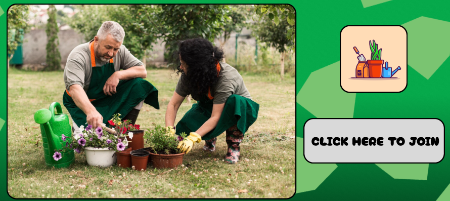


Within desktop, mobile and social media the same relevant images have been used to demonstrate things like upcoming events (can be seen in figures 6, 7 and 8). This has been done to avoid confusion with different imagery across different platforms, therefore retaining users as they wont get mixed up with imagery and possibly sign up for the wrong event.
(All images of people have been downloaded legally from freepik)