Introduction.
Within this post the initial research phase for the 3 briefs given will commence, the 3 briefs will indulge in heavy research upon evaluation of target audiences needs, creation of mood boards for further analysis of colour combinations and competitor research with the advantageous and disadvantageous aspects, the 3 briefs mentioned are:
- Eco Future – Eco friendly green energy company.
- Influence Hull – A business consultancy group.
- Cab-E Online – Local taxi firm looking to go online.
Eco Future.
Eco Future is a company that seeks to providing clean environment friendly energy with the service of solar panel installations for a reasonable cost. Residents may have issues trying to reduce their carbon emissions, this is where Eco Future comes in and provides for an affordable price, with the only issue being, constructing a recognisable brand identity.
Competitors.

MyEnergi uses a green lightning bolt as the logo to portray renewable energy, with the colour green being used to show eco-friendliness.
Green Energy Electrical uses the recognisable green colour to yet again demonstrate that the company is about green energy, on the other hand the logo is very simple and corporate looking which may turn away some future customers.
Mood Board.
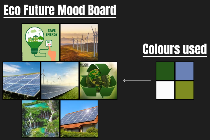
The Eco Future mood board has multiple images of renewable energy sources such as wind turbines and solar panels with the addition of nature. These images were chosen as they show renewable energy with a green and healthy future. Within the images are very beautiful landscapes and sceneries, this was done to show the customers/users what they will be preserving by choosing Eco Future. Additionally, the colours used show a very environmentally friendly pallet, with the usage of green, white and blue.
Influence Hull.
Influence Hull is a business consultancy firm that provides leadership, efficiency, and professionalism. Additionally, influence hull wants to dominate the space with their services, to do this they require a logo that doesn’t look corporate and instead looks inviting.
Competitors.
Oak Consult has a fun looking logo with a tree, within their website they state that “Mighty oaks from little acorns grow” which dictates that with their assistance the users will prosper without hardship.
Frugal Consultancy/Design depicts a simple logo with a very boring font that could lead to users turning away as they may think it looks too corporate or unprofessional with the font.
Mood Board.
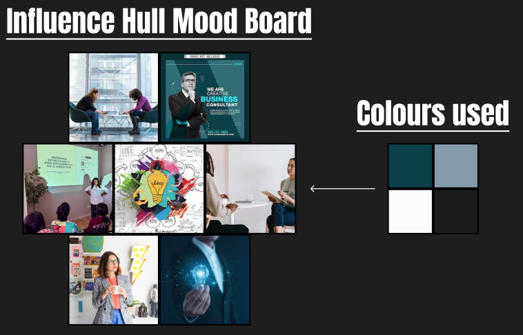
The Influence Hull mood board has multiple images of face to face conversations with the addition of a lightbulb to show innovative thinking. These images were chosen as they show friendly conversations to build a comfortable environment within the office. The colours that have been chosen from the images are blue, black and white, these colours give a calm mood with the touch of seriousness/professionalism to show the consultant is here to help.
Cab-E Online.
Cab-E is a new organisation that has made it their mission to dominate the online space with fast and reliable taxis, this will be done by having distinguishable taxis that can be recognised from anywhere, this will ultimately serve as an easy way to promote the organisation. To regain user retention the interface within the application should be easy to navigate and appeal aesthetically to the eye.
Competitors.
Within both of these companies they have a mobile application for customers to use, but the application is not very appealing to the eye as the style is very corporate.
WER2 TAXIS has a very simple but effective logo with the image of a taxi and a pinpoint marker to show users that the vehicles arrive safely within the destination at all times.
HULL CARS has a very bad logo as it does not provide any image to show that this is a taxi company, ultimately leading to users being confused what their organisation is about.
Mood Board.
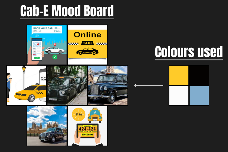
The Cab-E mood board has the iconic yellow and black taxis that can be found in New York and London. Additionally, images of mobile phones with taxis have been added to show the usage of them within the online space. These colours have been used as they demonstrate the primary colours of a taxi for recognisability.
Defined Mood Board.
Moving forward I have chosen Cab-E as the brief of my choice, Cab-E will focus on a retro taxi company aesthetic that has gone online.
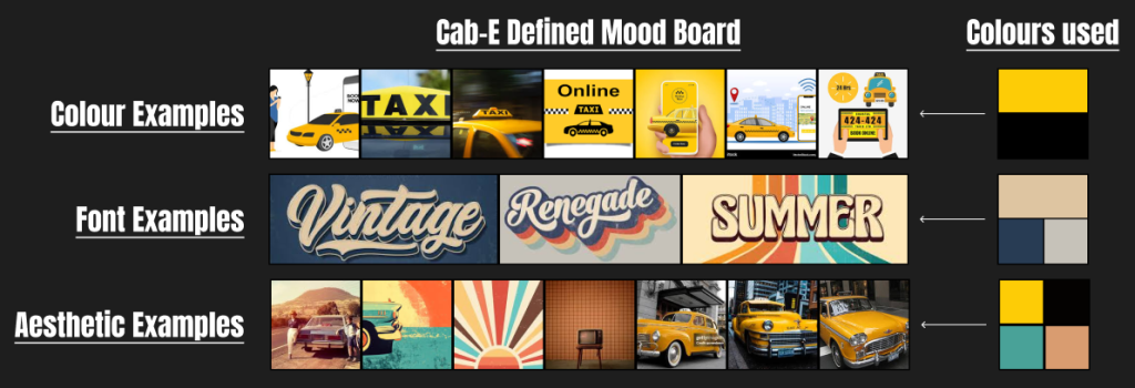
Within the defined mood board I have constructed, the primary colours used will be a black and yellow as vehicles with this colour pallet will stand out in the public eye and bring future customers. The font style and colour for the mobile application and logo will include a vintage/retro font and a warm crème colour to further support the vintage look. The overall aesthetic used with the vehicles out in public will remind the customers of the recognisable New York taxis used in the late 20th century
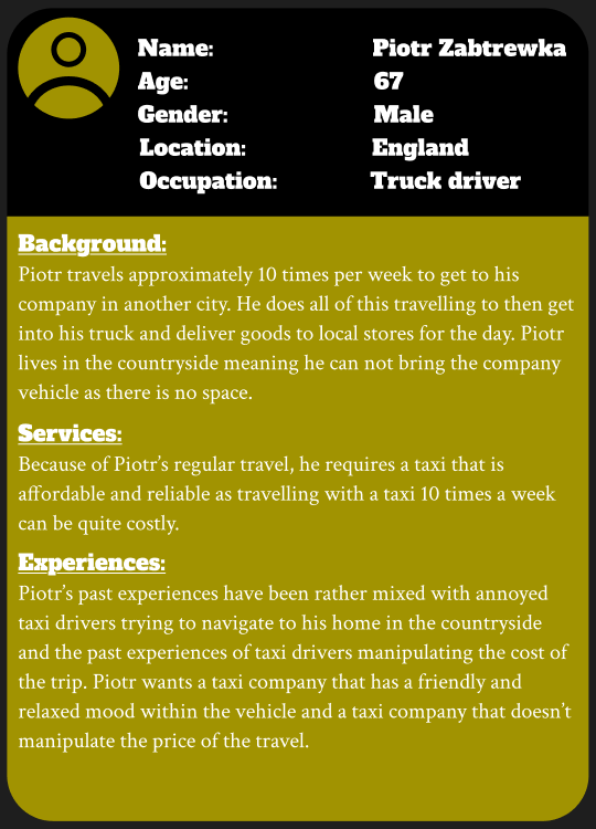
User Persona:
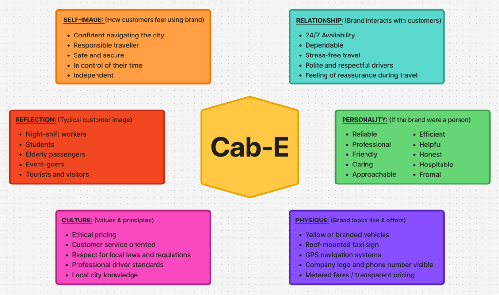
Brand Prism:
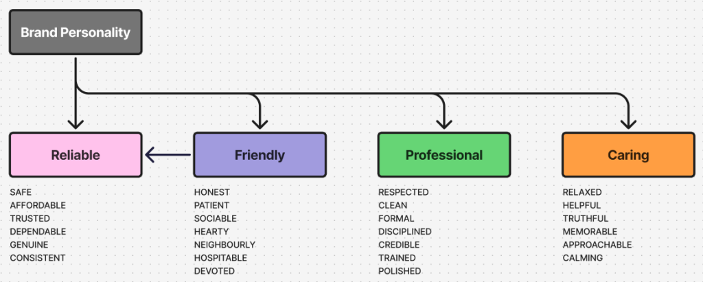
Brand Personality:
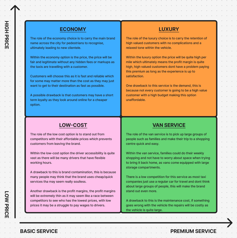
Brand Matrix:
References:
myenergi (2025) Homepage. https://www.myenergi.com/ [Accessed 2/12/2025]
Green Energy Electrical (2025) Homepage. https://greenenergyelectrical.com/ [Accessed 2/12/2025]
Oak Consult (2025) Homepage. https://www.oakconsult.co.uk/ [Accessed 2/12/2025]
Frugal Design (2025) Homepage. https://frugaldesign.co.uk/ [Accessed 2/12/2025]
Wer2 Taxis Hull (2025) Homepage. https://wer2taxishull.com/ [Accessed 2/12/2025]
Hull Cars (2025) Homepage. https://hull-cars.com/ [Accessed 2/12/2025]