Introduction.
Within this post, I will be creating 3 different banners for advertisement purposes with each banner being created within the spaces of certain pixel heights and widths. The banners and justifications for design decisions can be viewed bellow.
Banner Ads With Explanations.
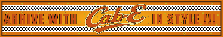
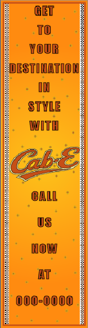
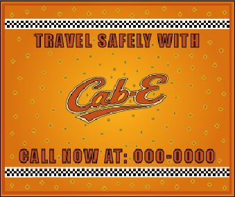
First of all, all 3 of these banner ads can be easily seen throughout any website from the choice of colour, this is because a bright orange and yellow gradient has been used to incorporate the traditional taxi colours, this is done to grab the attention of any users and still keep the brand image intact. A supporting factor in this is the black and white ribbon plastered along all 3 banners, this is yet again done for aesthetic purposes and to remind users that this is a taxi company, as many taxi firms in the late 20th century had this patterned livery across vehicles.
Each phrase written on the banners are different sizes to ensure they fit correctly along the banner, the language used ensures that when users stumble across the advertisement they will know what the company is about, for example “ARRIVE WITH CAB-E IN STYLE !!!” is used in figure 1 to let users know that this is a taxi company from the “ARRIVE” section, and that the company name is “CAB-E” which yet again lets users know this is a taxi company from the word “CAB”. The logo placement is deliberately placed in the middle of the banner at all times, this is because when looking at the banner the eyes shift to the middle, and having users read the brand name will ensure that users remember the brand when seeing it in public, leading to users trying out the taxi service themselves. In addition the logo is placed in the middle as the text always conjoins with the logo to make a sentence ensuring when users read the statement, they also read the brand name which yet again stays with them in memory.
Within the rectangle and skyscraper ad, I have included a call to action with the statement encouraging the users to call the number listed at the end to get into contact with CAB-E. This is a friendly message that pushes the users to try the taxi company for themselves without having to look for the company telephone number and possibly getting lost.
Additionally the logo, ribbon and text have been refined to smaller and larger sizes to correctly fit the appropriate advertisement to ensure no parts have too much or too little stroke effect, etc making the brand image look unprofessional.
Finally this reflects back to the previously created user persona as “Piotr” may stumble across this advertisement and think to himself that he needs a reliable taxi company that’s safe, safety was one of his listed concerns which is ultimately overcome with the statement of “TRAVEL SAFELY WITH CAB-E CALL NOW AT: 000-0000”.