Post 3 will focus primarily on the typography and logo, the effects of user interface and experience will be discussed bellow.
LOGO
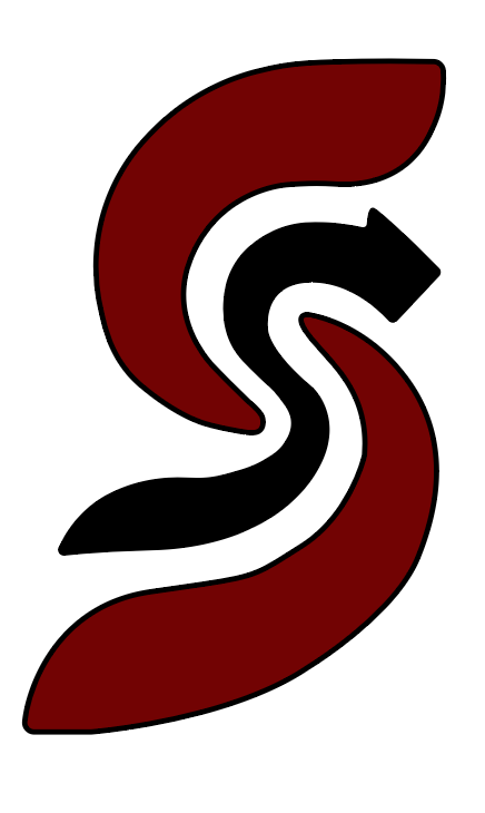
The name of the event will be “Stream Sync” this is done because of a few reasons. First of all, the event is primarily about influencers streaming together and having fun with each other, this is where the word “Stream” comes into play with the addition of “Sync”, meaning that all the influencers that are streaming together are in sync playing at the same time all in one place. The logo was created with 2 red curved lines forming a subtle “S”, while the black line is also creating an “S” but with an arrow at the tip, the arrow represents the “sync” symbol. The logo has been created simply on Adobe Illustrator using the “pen” and “curvature” tool to make the edges of the logo smooth, once the layout was created I used the colour HEX code #720303 which can be seen in post 4 as a dark red colour, in addition a simple black colour with a HEX code of #000000 which can also be seen in post 4. This has been done to keep the brand identity as the whole brand revolves around these 2 primary colours, hence using them for the logo is without a doubt a must.
TYPOGRAPHY
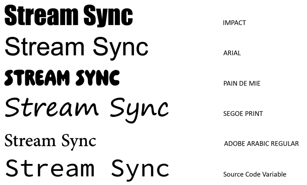
Next was choosing the correct typography to go along my logo. This was done by selecting 6 different type faces and letting my users once again decide what looks best with the brand. I have given the users a set of unique and different typefaces to chose from, the brand name is written with the type face and the name of the type face beside it. This can be seen bellow.
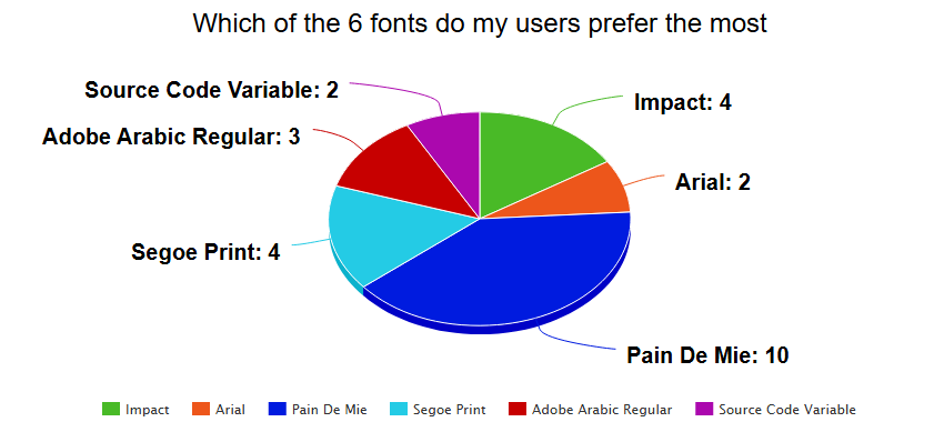
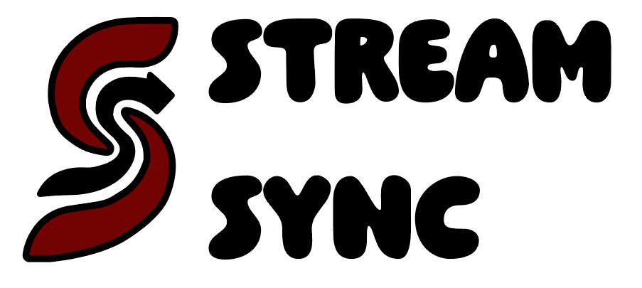
Based on the pie chart above “Pain De Mie” has been chosen by the users to be the primary font of the brand. After close inspection of the type face it is clear why the users have chosen this for my logo. The first reason being that the typeface is a wavy and bubbly font which works really well with the logo, this is because the logo is quite fluid and wavy itself, this ultimately leads to the logo and type face working well together as they share similar qualities and features. The second reason is that the other type faces lacked style and identification which according to Sagi Haviv (2023) “A logo is not communication, its identification. Its the period at the end of the sentence. Not the sentence itself.” this quote states that once a logo has been created its sole purpose is its identification, thus the typography will help the logo reach its identification status across many users with its unique type face design. Finally the logo and type face can be seen bellow together.
Sagi Haviv (2023) Available online: https://fullstop360.com/blog/logo-design-quotes-that-will-improve-your-design-process-forever/ [Accessed 09/04/2025]