Post 2 will consist of the user experience and interface of the mid fidelity mobile application. Data has been collected from users once again just like it was in post 1 to ask what could be changed for an improvement to the application.
USER RESEARCH FOR MOBILE APPLICATION
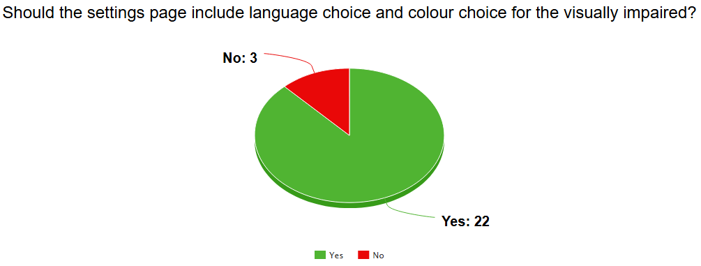
User feedback was conducted once again but this time it was to ask if the settings page should be identical to the websites settings page. As demonstrated bellow the majority of users picked yes, this implies that the same people who would have a colour blindness can use both the website and mobile application to successfully navigate throughout the app.
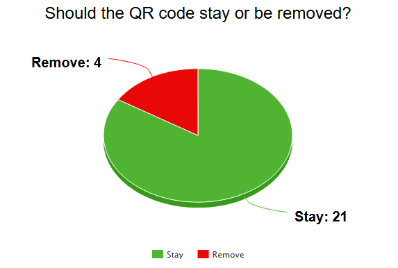
Another question has been asked within users to determine a significant change, they were asked if the QR code page should stay or be removed and move somewhere else. Once again the majority of people have chosen it to stay as it gives the mobile application more functionality, in addition the users suggested that the QR code could be sent to the email and phone number associated to the user. The pie chart can be seen bellow.
MOBILE APPLICATION DESIGN
Based from the users feedback (which can be seen above) changes have been made to the application which will be discussed bellow
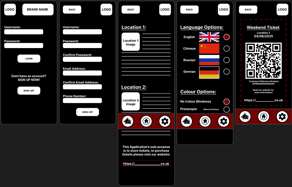
The first major change from the low fidelity prototype is once again the colour scheme of it being primarily black with a small red accent to once again support the brand identity. Secondly the main menu page has been changed for a more aesthetic reason, this is done as the image used to be to big with no text, this time a smaller image is used with supporting text to briefly talk about what the locations are going to include. In addition on the bottom of the page there is a hyperlink that leads directly to the website in case users have downloaded the application thinking you could purchase tickets here, this was done because Frank Chimero (2023) stated that “people ignore design that ignores people.” which means that a design which guides users without confusion will keep them interested with a higher likelihood of contributing to the brand. Lastly, based from the two pie charts above, the 2 implementations have been programmed which means the QR code can be seen with the addition of the settings page being identical to the websites.
Finally a layout grid has been placed into the mobile application, this has been done purely for the user experience and interface, a good looking application will convince the users to stay and explore more. The layout grid consisted of having 4 columns with a 30 margin and 20 gutter to ensure every page is consistent and there are no random anomaly’s between pages.
Frank Chimero (2023) Human Digital. Available online: https://humandigital.com/insights/people-ignore-design-that-ignores-people [Accessed 09/04/25]