Typographical Graphic Standards is essential to making brands stand out from one another. Creating a viable brand identity should allow viewers of the website to differentiate your website from others with aspects such as, the logo, typography and colours used. These 3 key aspects should be implemented in such a way that they will easily complement each other and stand out from the rest from a viewers point of view.
The task was the construction of typographical graphic standards for a horror video game publishing company and increase the awareness of its products. First of all the company name was created with words that fit the genre perfectly, I thought of the word “Atomic” as many people find atomic weapons terrifying, then used the word “Shroud” as once an atomic bomb explodes it leaves a shroud of dust and chaos, therefore the 2 words compliment each other perfectly.
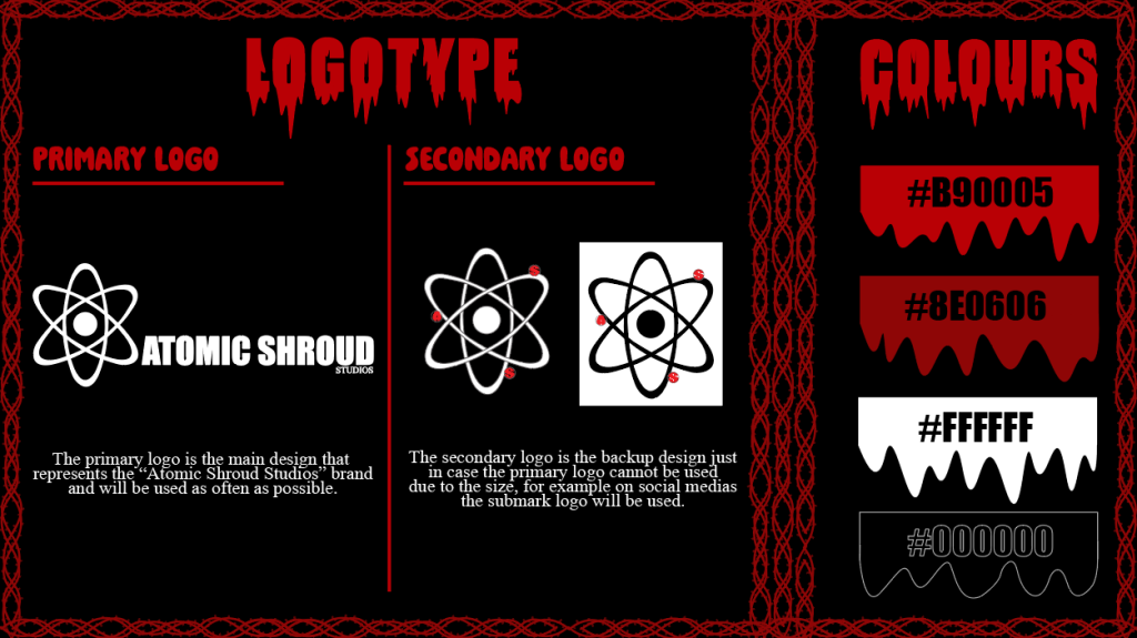
Once the name of the horror video game publishing company has been constructed, next up is the colour pallet, since the audience is from the ages of 18-25 I chose the primary colours as black, white and 2 shades of red. This is because people from the ages of 18-25 will be more into the mature colour pallet instead of bright vibrant colours especially with the horror theme. While researching different horror games I noticed that a lot of horror games have a dark pallet to give the horror atmosphere when looking at the cover, in addition a bright colour pallet aesthetic would repel my target audience.

The next step was to construct a logo that draws people attention and gives a competitive advantage over other brands which can be seen in figure 2. Additional information about the progression of the logo can be found in the “Traditional or Online Conceptual Editorial Masthead (Logo) Design” post.
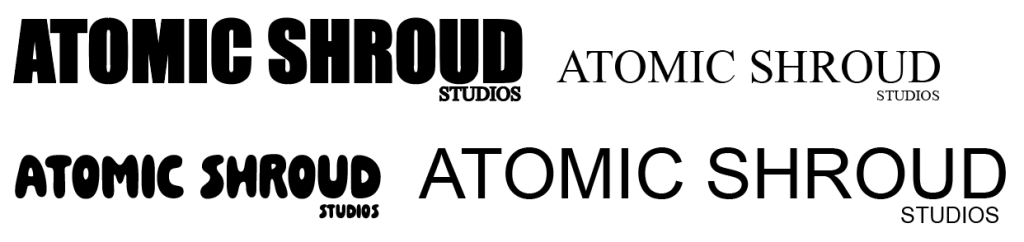
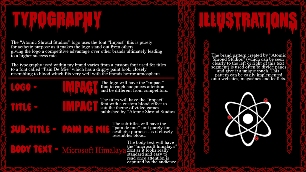
The typography was the next subject to construct, by viewing figure 3 I have used 4 different typefaces. The first type face used is for the logo with the use of the “Impact” typeface. This was cleverly selected from “figure 5” by Lewis Wainwright which he stated “It makes the logo bold and powerful compared to the other typefaces”. The second one being a custom typeface with the assistance of the “Impact” typeface, once the title has been written I use a paintbrush to create a blood drip effect to give the title more life and the gory horror theme. The third typeface used is “Pain de Mie” which has been used for sub-titles, this is purely for the reason that this typeface suits the horror theme that I was going as it closely resembles someone writing with a bloody finger. Lastly my fourth typeface used is the “Microsoft Himalaya” typeface for body text, this is because this font is very sleek and easy to read when a whole paragraph is typed out using it, in addition it uses a lot of ascenders, descenders and serif’s which makes the wording look slightly sharp and pointy which fits well with my horror theme.