The company’s logo is mainly the most recognisable feature of a brand, and to catch the target audiences eyes a powerful logo will have to be constructed to beat other competitors with key characteristics which will be explain bellow in further detail.
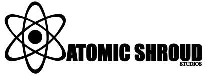
The Primary logo should be constructed to stand out from competitors and attract your target audience. The simple but effective logo does this perfectly, this is because firstly, the colour is just black making it sleek and appealing to the eye as if it were to have multiple colours splashed around it may repel people away as they may feel overwhelmed. Secondly I removed the rotating orbs as the logo would have been too crowded and too much would be going on. Next, guidelines have been used at the bottom of the slanted rings so the text can rest perfectly on the same axis as the logo. Finally the typeface used in the logo is the “Impact” typeface with a black colour, this was done as the atomic symbol generally shows seriousness and power, hence the “Impact” typeface was used as it has a strong structure just like the atom itself.
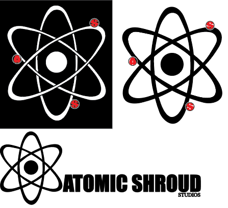
To construct the conceptual logo for “Atomic Shroud Studios” I searched for the atomic symbol and noticed that each ring from the atomic symbol has a rotating orb, I used this idea to put the initials of “Atomic Shroud Studios” within the orbs. This is conceptual as my company name will be constantly rotating within the logo, I used a red colour for the orbs just to remind the target audience that this is a horror themed brand. In addition I created the first ring, then proceeded to copy and paste the ring a total of 3 times so the logo was symmetrical and made professionally without errors. Lastly the logo was constructed in a black or white variant to suit all occasions in case the background is white I can use the black version of the logo and same goes for the white logo.
I decided to have no background within my logo as I wanted to have it blend in with the background and fit with the horror theme no matter what colours may be used in the future. Finally a piece of feedback that was very important to the construction of my logo (which can be viewed in Figure 2) was by Yao Wenbo which he stated “Instead of having the studios part of the logo drag on to the left, make it smaller and place it underneath the word Shroud” this feedback was very important as it made my logo very professional and appealing to the eye.