The subject I have chosen is horror games with an audience of 18-25 years of age, my purpose is to spread awareness for horror games for people to buy.
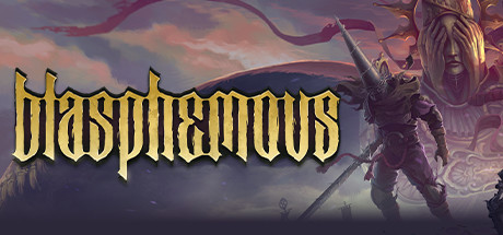
The first way Blasphemous uses typographical writing is on the main cover of the game which I will be focussing on. The word “blasphemous” is written across the top portion of the cover in a custom font created by the game developers themselves. The font they create has a gothic and old feel to it which represents the game perfectly, this is because the game itself is set around the 16th century in Spain when the common religion was Roman Catholic. The font that blasphemous uses makes the user understand that this game is set in an old time frame, the background of the cover helps support this with the “Penitent One” which is portrayed with metal armour and purple rough rags with a worn out sword which would be seen a couple hundred years ago.
The next Typographical design is the golden colour choice. Firstly the word “Blasphemous” means an act against god which juxtaposes the golden colour the creators used for the word. This is because gold is shown as a luxurious and prestigious material which was used in the 16th century, whereas blasphemy is something that is considered by many people as a death penalty as its an act against god. The golden colour choice can be portrayed as the “Penitent One’s” goal and a good thing, this is because the soul purpose of the game is to go around and commit “blasphemous” acts against gods that have ruined the lives of millions around the game.
Finally on the word “Blasphemous” the font has really sharp edges around every letter even for a letter such as “o” which is considered very smooth and round. The sharp edges of the letters portray that this game is not going to be very family friendly and for young audiences. This is shown as the game includes a lot of death and violence and a core aspect of the game is for the “Penitent One” to use a sword to defeat his opponents. The sword is being portrayed beautifully as it’s very sharp and pointy just like the corners of the font used.
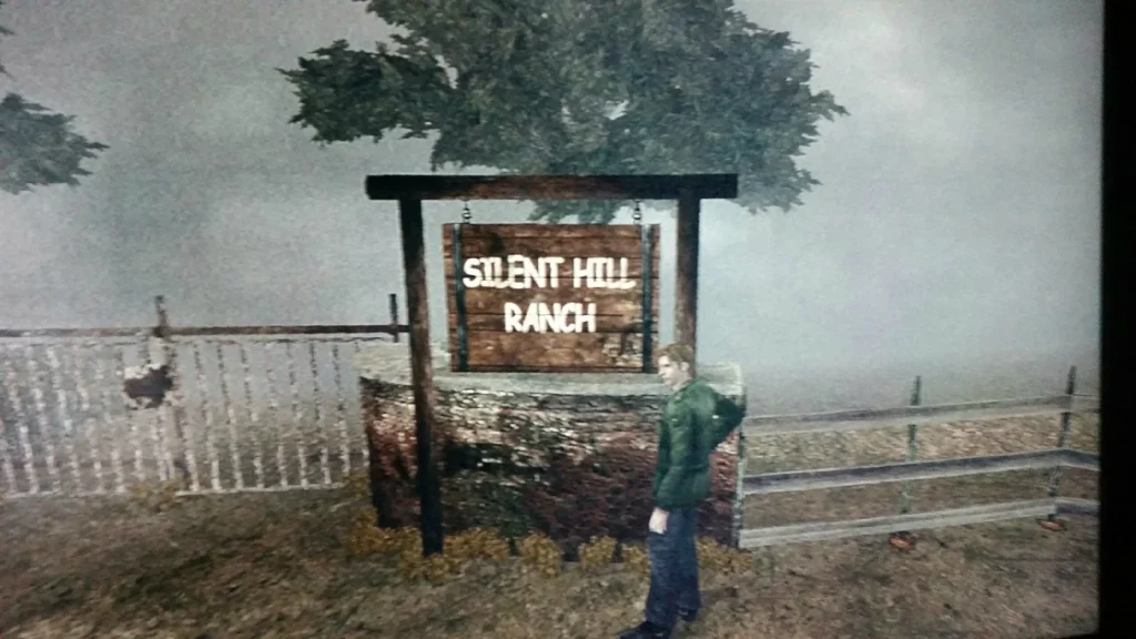
The original “Silent Hill 2” game has a poor example of typography used near the beginning of the game. This is because, the atmosphere of the surroundings is foggy, dull and creepy. This gives a horror feel to the game, whereas the sign indicating where the player is located reads “SILENT HILL RANCH” in a bright, thick and white Comic Sans font. This use of Typography doesn’t fit the mood of the game at all and should be altered slightly with a darker tone and creepy style to get the player properly immersed into the game. Finally another problem with this typography is that the characters have really smooth and round edges with no damages and rough patches, this would not make sense at all logically as this stage of the game the scenery is abandoned and in ruins. I will fix this great error by changing the font style, colour and the typography aesthetic.
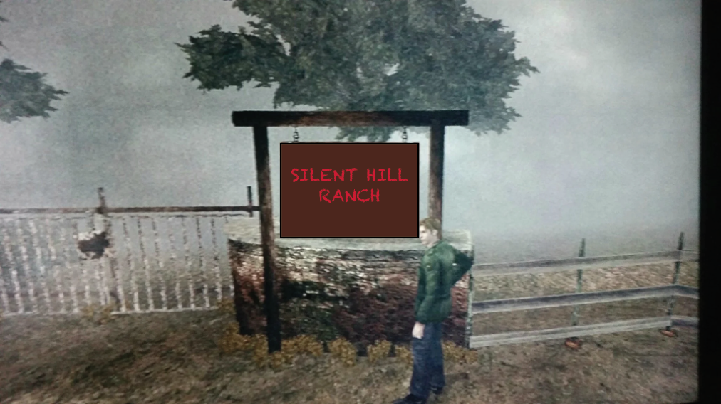
I have re-created the sign as what I think is an improvement to the original piece. Firstly I have changed the font from Comic Sans to Chalkduster as I think it is more appropriate for the setting of the game, this is because the characters have rough edges and an almost worn look to them indicating it is old and creepy. Secondly I changed the font colour from a bright, white to a rich, red colour. This is because a red colour creates an uneasy and anxious environment which really sets the horror tone of the game and makes the player curious on what happens next. Ultimately I think my version of the sign is a substantial improvement to the original for the sole purpose of matching the surrounding setting and preparing the player for the upcoming events.
Figure 1:
Steam Games (2019) https://store.steampowered.com/app/774361/Blasphemous/ [Accessed 23/10/2024]
Figure 2:
FriedChickenPotato (2015) https://imgur.com/gallery/MUngEZ2 [Accessed 23/10/2024]