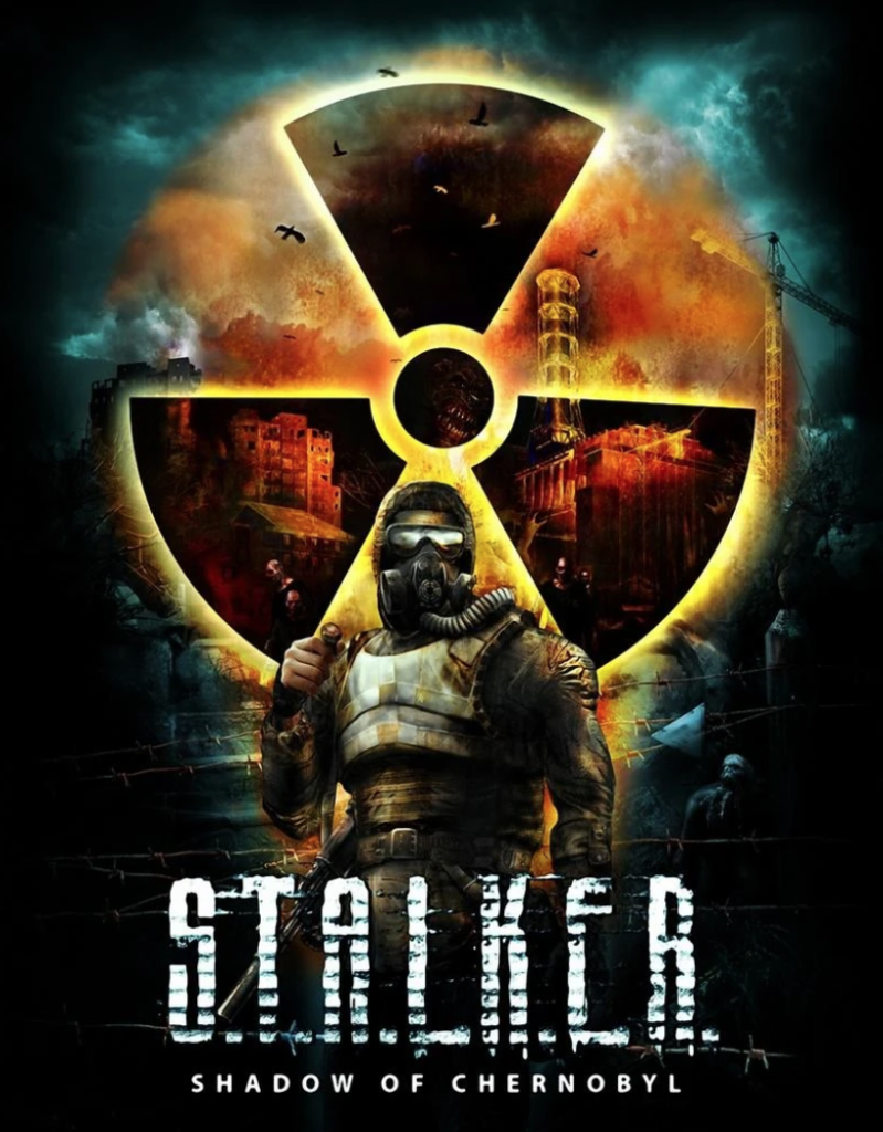
The game “S.T.A.L.K.E.R shadow of Chernobyl” has really good conceptual design within its logo. The first reason is within the radioactivity symbol there are ruined buildings that have been impacted by the blast of the Chernobyl power plant. This is a conceptual design because the images of the ruined buildings are within the radioactivity symbol implying that the buildings have been affected by the effects of the blast and radiation also showing that whatever is in the symbol is completely inhabitable and littered with danger. The small circle in the middle of the radioactivity symbol has a hostile creatures face within it showing the audience the true terror that has been unleashed within the blast zone of the plant, This leaves the audience curious on what that creature is exactly concluding in the viewer being interested in buying the game.
Another conceptual design within the logo and name is with the phrase “Shadow of Chernobyl”. This is a conceptual design because once a power plant like Chernobyl explodes everything in its surroundings is scattered with darkness and death implying that everything around Chernobyl is as dark as a shadow which is also shown in the logo. This is shown in the logo as within the middle of the screen is a bright radioactivity symbol indicating where the blast came from and everything around the symbol is dark and unrecognisable showing the devastating effects of a power plant explosion.
Finally the use of colour draws the users eyes towards important aspects of the conceptual designed covers such as the glowing radioactive symbol and all the hidden messages within the symbol which makes the cover conceptual.
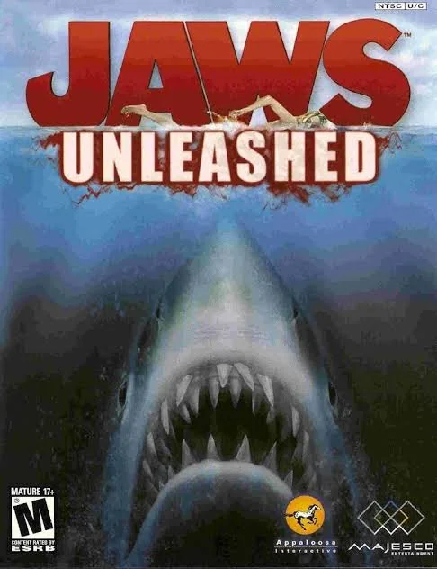
The jaws game cover is a poor example of conceptual design as I personally think the word “JAWS” is very bland and basic and needs further design in order to show the user what the game is about, furthermore the only slight example of conceptual design is the blood dripping from the word “UNLEASHED” which doesn’t describe the game very well and could mean anything. This is why I will be focusing on improving the “JAWS” aspect of the cover. Another reason this has no conceptual design is on the lower Half of the page as the only thing that is shown is the shark and a completely empty void around it.
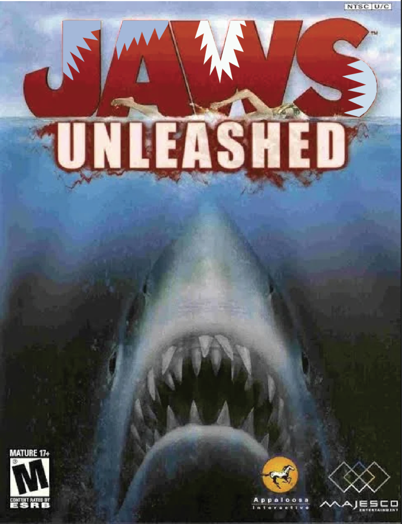
This is my improved version of the “JAWS UNLEASHED” game cover. The first thing I did was alter the “JAWS” letters from the title, I did this by adding shark bite marks on every letter. These bite marks imply that the game is all about a shark going around eating everything that moves in order to get bigger and stronger. The bite marks also correlate with the word “JAWS”, this is because a sharks main purpose with their jaw is to bite. Within the bite marks I have also changed the colour from blue to white, this is because I wanted to make the bite mark look see-through as if part of the letter is missing and you could see the sky background through it. I have only taken part of the word out instead of the majority of the word, this is because I wanted the word to still be readable after the bite so the user could easily identify the game.
Figure 3:
S.T.A.L.K.E.R Wiki (N.D) https://stalker.fandom.com/wiki/S.T.A.L.K.E.R.:_Shadow_of_Chernobyl [Accessed 24/10/2024]
Figure 4:
Wikipedia (N.D) https://en.wikipedia.org/wiki/Jaws_Unleashed [Accessed 24/10/2024]