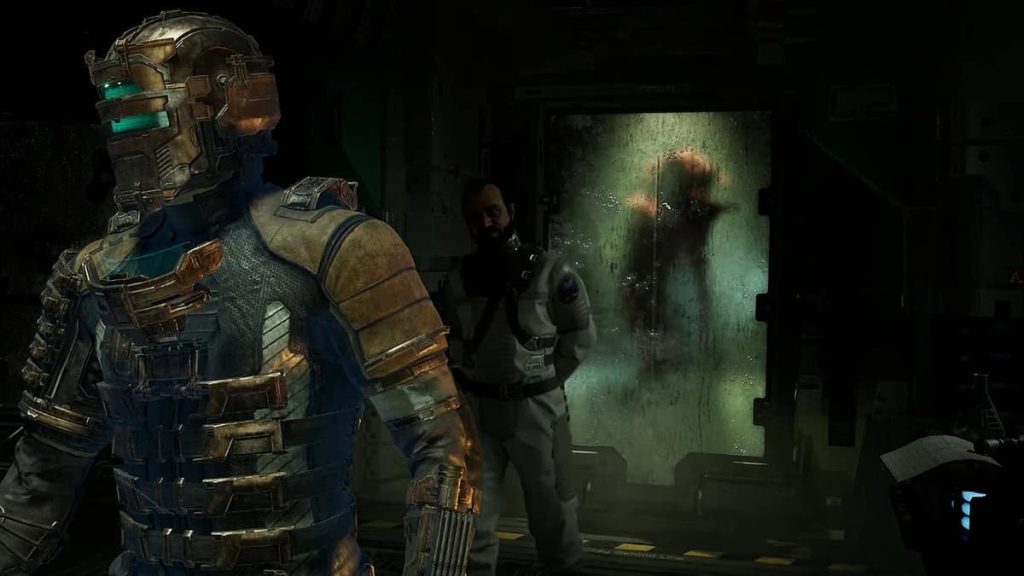
A good example of composition within video games is this scene from a game called “Dead Space”. There are a few reasons for this, firstly being a green dimly lit room in the centre of the photo. This is a good example of composition in video games as once the audience sets their eyes on the photo, their eyes will automatically shift towards the dimly lit room as it stands out a lot compared to its dark surroundings. Once the eyes are shifted towards the room the audience will notice the silhouette of a humanoid creature, from a first glance it gets obvious that this creature is hostile from the appearance and the yellow/black caution tape on the floor to the security guard denying entry within the contained creature. Ultimately the small dimly lit room really grabs the audience’s attention and leaves them wondering what exactly is that creature being portrayed is and leaves them with a sense of danger.
The other way this scene perfectly creates visual composition is the soldier on the left side of the photo. This is because the soldier is well lit and detailed showing his importance as he proceeds to walk to the side getting ready for battle with parts of his suit that grab the audience’s attention such as, the bright neon green visor and the copper-coloured helmet encasing it, and the skeleton like armour protecting his vital points. On the other hand the security guard right behind him is poorly lit giving the impression that he is in the soldiers shadow with dark clothing, showing the audience the lack of importance to that specific character and focusing on the soldier.
Finally another example of composition used in this is the angle the soldier is walking away and the straight door in the background. This shows the use of different angles being used to show the importance of certain things within the photo such as the soldier.
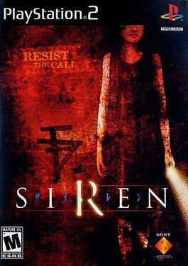
The poor example of Composition within horror video games is a game called “SIREN” for a couple of reasons. The first reason being that the user will be confused on what’s going on leading to the eyes shifting from one place to another and not fixing on a certain aspect of the cover. Secondly the woman on the front is standing in without a pose or angle making it very bland especially how the background around her is completely straight to, this ultimately makes the cover look boring with no creative angles. Lastly the cover doesn’t have good lighting to show the important aspects of the cover, the whole cover has random lighting of bright spots and dark spots. Ultimately the lighting and positioning of the wall and girl need to be altered.
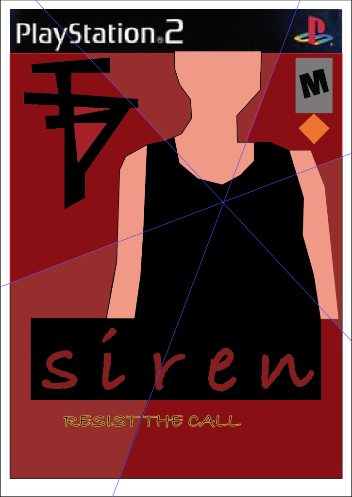
This is my improved version of the bad composition cover. I have improved this firstly by removing the confusing background and adding 6 shapes which all point to the centre of the woman, this is because I want the eyes of the users to shift to the woman as she is the main centre piece of the game. Secondly I changed the location of a few things such as the title, Chinese symbol and the games ratings to appropriate places to make the cover less confusing and more appealing to the eye. I moved the title “resist the call” to the bottom near the “SIREN” as the full title should be together and not scattered across the page. Lastly I increased the size of the woman as she is the main villain of the game and I wanted people to shift their eyes towards her more and show that she is important.
Figure 5:
Harrison Abbott (2023) https://bloody-disgusting.com/video-games/3755186/dead-space-the-collectable-documents-that-add-more-storytelling-depth-to-the-remake/ [Accessed 28/10/2024]
Figure 6:
Wikipedia (N.D) https://en.wikipedia.org/wiki/Siren_%28video_game%29 [Accessed 28/10/2024]