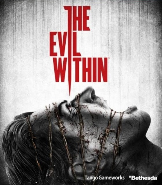
The horror game I have chosen for good colour is “THE EVIL WITHIN” for many reasons. The first reason is the red colour used on the title, this is a good example of colour as the characters from the title have formed into a needle that is being lowered into the main characters eye ball, the colour red could be interpreted as blood or gore as once the needle is lowered and inserted blood will spew out. Another way it can be interpreted would be that the needle is red as a sign of danger which can be shown by the main character screaming from fear.
The second way colour is shown is the white and grey background. This is because it shows that the game is eerie and dark, in addition it makes the audiences eyes shift right onto the title as it stands out from everything else on the screen with its bright red colour compared to the grey/white background. The bright red title is also a conceptual design as the title looks like a needle, with a mix of composition to grab people attention to the needle by making the background barren and empty with the focus on the title.
The final way colour is being presented is within the barbed wire wrapped around the main characters head. This is because the whole cover is black and white apart from the title and the barbed wire, the eyes of the audiences would shift to the barbed wire as any colour on top of black/white stands out very easily and the barbed wire is a light brown colour. The reason to why the colour brown was used is to show the importance of the barbed wire which shows that the main character is trapped and unable to escape the nightmares in the game which is also symbolised with the titles needle near the eye ball.
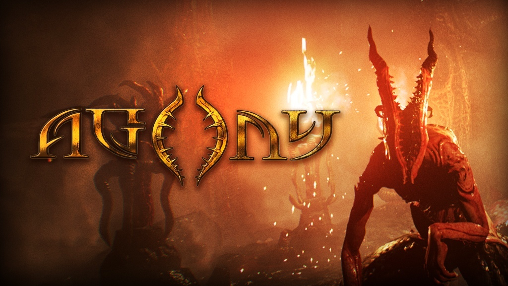
The horror game I have chosen for my bad example of colour used is a game called “AGONY” for a few reasons. First of all the title should not be a bright yellow colour, this is because it may be hard to see for some people because of the bright yellow flame directly behind it, ultimately meaning that the colour yellow on top of yellow should not be an option. The second reason is that the word “AGONY” symbolises extreme measurements of pain and suffering, having a bright yellow title with that meaning does not make sense at all and should be re-coloured into a darker colour. This should be done to symbolise the word “AGONY” better such as dark red or black, doing this small adjustment would lead to the game cover to look a lot more pleasing to the eye and have that horror touch it is missing.
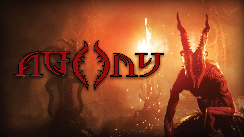
For my improved version of colour in horror games, I have changed the primary colour of yellow to a dark red with a thick black outline. Firstly I have chosen a dark red colour for the title as it suits the word “AGONY” a lot better than a bright yellow colour. In addition the dark red colour compliments the red creature displayed on the right hand side of the cover, the reason for creating a red colour to match the creature is because the “O” in “AGONY” represents the creatures disfigured oval head, leading to my decision on referencing the creature better in the title. Lastly I have created a thick black outline for the title to simply make it stand out more as the previous title with the yellow colour blended into the partial yellow background.
Figure 7:
Wikipedia (N.D) https://en.wikipedia.org/wiki/The_Evil_Within [Accessed 28/10/2024]
Figure 8:
CJ Melendez (2017) https://www.relyonhorror.com/latest-news/agony-publishing-deal-means-good-and-bad-news/ [Accessed 28/10/2024]